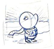
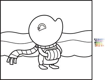
So I felt like I had to finish it up and paint it. I cleaned it up in Illustrator. I also grabbed a bunch of colors that would match well together (if you see the small swatches) which would make it easier to color when I sent the image to photoshop:
And then I took it into photoshop. Now recently I've been really in love with the Gaussian Blur filter. This tool definitely has it's purpose, but what I've been doing recently is roughly laying out the gradients of my character and then using a large dose of gaussian blur (usually around 15 percent or so) which completely takes out all the lines and brush strokes and leaves a very smooth gradient of color. One problem with doing it this way is that the objects you've blurred tend to ghost around the edges (because it blurs out to white)...of course I always go back in and recolor everything - this way I have some brush stroke, but also a very smooth transition of colors. The problem this time around is that I did it too much. And the final result was just too photoshoppy. I feel thats the worst thing to do when painting in photoshop, is to make it look like you've done it...so my gaussian blur technique (which worked well on the Adelia in space piece) might be retired early (or I'll just use it a little more sparingly). I was probably falling in love with things getting a little too smooth.
Anyway - so I did the color and decided I hated it because of the gaussian blur and how smooth everything ended up. As well as all the darks were too dark and there were no midtones. basically there were a lot of problems...so I recolored it. And this time I did it the way I've heard a lot of other artists paint in photoshop. This is my first 'finished' illustration using this technique. Basically when I paint I keep the opacity (of the brush) at 100 percent. And I lower the flow to 1 percent. that way I can slowly build up the color and gradients. What I've been reading recently is that a lot of people do just the opposite - they lower the opacity (to around 30 percent) and keep the flow at 100 percent. So that's the way I did this piece. It was tough because I love the smoother look, but I've been trying to add brush strokes to my illustrations - because even though my brain is telling me to cover up the strokes, I know that it looks better.
So this is the final illustration:


No comments:
Post a Comment