I had a bunch of random drawings I thought I'd pop up here - just because they don't really belong on their own post and I wasn't really going to do anything with them anyway. But maybe I'll post some to instagram?
This was for our stock images site - I thought the idea of two knights facing off would look pretty awesome. And I was right!
This is for an undisclosed project I was working on late last year. I did a version where the kids looked quite young, and they wanted them aged up a bit - so I redrew them as older versions. I did several styles (with version 2 being my favorite), but they ended up not doing anything with the project, so these drawings just sit here on this blog not doing anything...
Here's the kid version - they were deemed 'too junior' which could be a death sentence for a show trying to appeal to the older kid audience.
I was drawing a kid, and this time for a junior show I was trying to develop, who would end up in a monsterous situation. I wanted him to be as innocent as possible, and maybe have a hint of anime hair.
Speaking of Monsterous - this was one attempt at the monster that finds the boy above. As you can see, he's even cuter than the boy is. Below is version two. This is yet another project that we didn't get too far with.
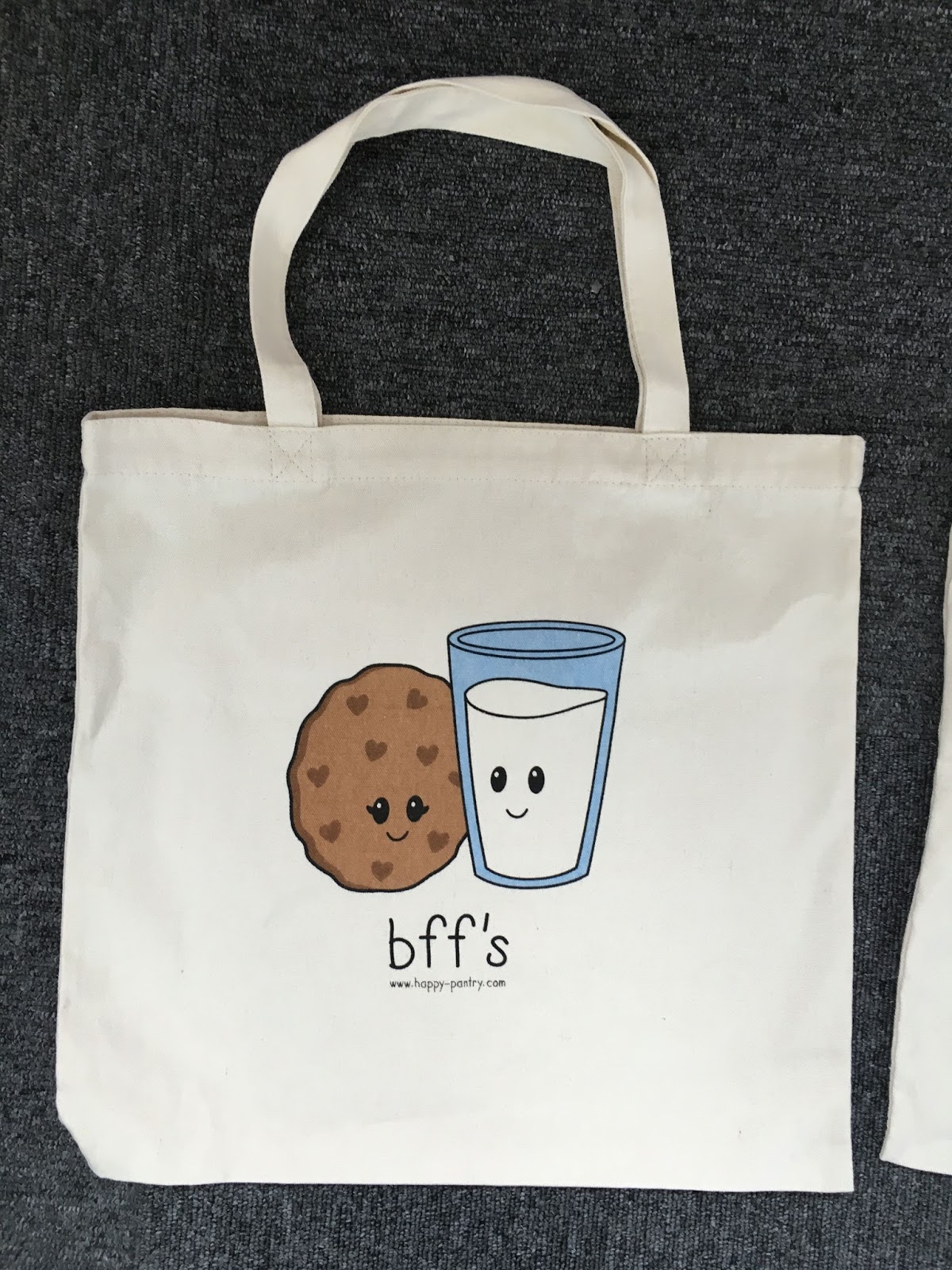
This is for Happy Pantry - Even Mona Lisa was a fan of our aprons. They're still available on our website at www.happy-pantry.com - and only $29.99! She's smiling because she's adorable in her new apron!
At the time I drew this, I was developing a series of cute monster toys. This was a stitched up doll. I thought it was rather cute and slightly scary.
Also for Happy Pantry - Peas on Mars. Says it all. It's terrible, and that's why it never made it past the rough drawing stage.
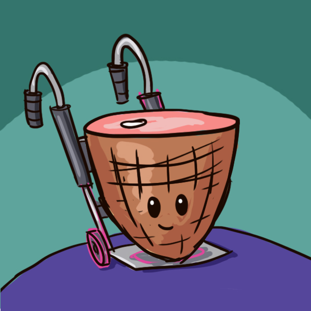
I drew this shortly after I drew Leonardo deCappucino - I thought it would have been funny to have a silence of the hams...but also, possibly, a little too adult for the kids. I originally drew his iconic mask as well, but Tracey vetoed that - this cutesy ham was my last ditched effort to get it made, but to no avail. The boss said no.
And finally - here's the last picture in our art dump. Another project we were developing - I think this is from 2010 or so, I wanted to have three kids that were kind of reminiscent of Edward Gory/Charles Addams characters and the feel that those guys put into their cartoon/comics. I won't say much more than that as I still want to develop this into something...maybe...at some point.