Friday, September 29, 2006

Adelie Penguin...

So I've decided that it'd be cool to do a series of penguins in three brackets...I previously had done profiles of penguins...but they seemed to be missing something - I really like the way these look - so I'm going to continue doing them. I have the illustrator cleanup of a little blue penguin (it's also called the fairy penguin...but I prefer little blue penguin...) which is actually the smallest kind of penguin...but that's what's coming soon. As of right now I have the penguin painted and I'm going to finish the background when I'm done typing this blog. This is the Adelie penguin. I really liked how the gradient worked on this one - instead of using the small brush to wet the entire area, I used a large flat brush to lay water down faster (which meant that when I applied the watercolor, it spread more evenly).
Photobucket - Video and Image Hosting
Adelie Penguin

A couple of updates...

I'm working to finish the Frankenpenguin piece - only I've gone a bit further than my skill level - in that I'm trying to put a background to him...and I haven't done that with my watercolors yet. So I'm taking it a bit slower, and, in fact, tomorrow I'm going to check out some books to see what my options are and how I could go about not screwing up the painting. As it is - I've finished the character (for the most part)...I have small bits of detail and touchup to do, but he's pretty much done:
Photobucket - Video and Image Hosting
Frankenpenguin
Also - I reworked the gradient background on this next one...it's just a bit smoother...so I decided to repost it - because it looks more finished to me:
Photobucket - Video and Image Hosting
King Penguins in Yellow
Pencil and Watercolor

Wednesday, September 27, 2006

Emperor Penguin

This was one of my first thumbnails for a penguin.
Photobucket - Video and Image Hosting
It was going to be one of my first attempts at a watercolor using my Dr Martin concentrated water color. I thought the first attempt came out pretty good - the only thing was that, at the time, I couldn't decide what I wanted to do with the background. So...I left it white.


Photobucket - Video and Image Hosting


After I did some other pieces I decided that it'd look nice if I did one of those gradient backgrounds on it (and I might go back and do it again with a blue background...just because I think the blue backgrounds look the best).
Photobucket - Video and Image Hosting
Solo Emperor Penguin: in yellow
Another thing that happened when I started this second one is that I changed the size of the piece. The original version of it was about 8"x11" and the second one was on a smaller 6"x9" piece of watercolor paper. The only difference between the two is that the smaller version couldn't have a pencil border because the penguin took up too much of the paper...so I just painted to the borders with the intent to put it in a glass frame where it would 'hover' in the center...there wouldn't be a need for a matt, as the picture extended to the end of the paper.
Photobucket - Video and Image Hosting
Solo Emperor Penguin: in yellow (framed)

Tuesday, September 26, 2006

A series of 3

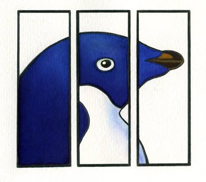
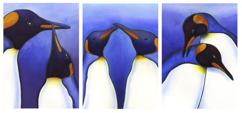
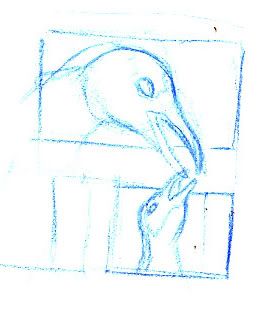
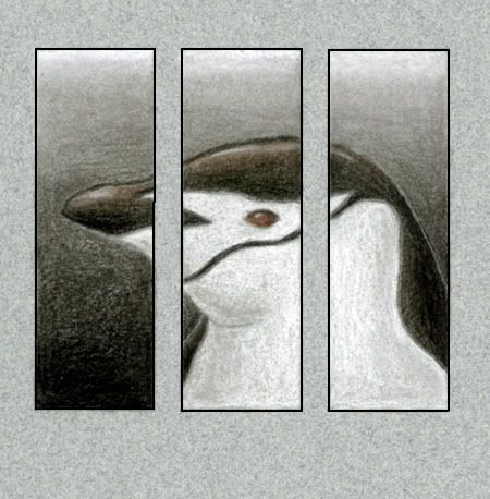
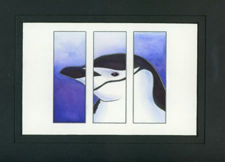
I got a frame that had 3 panels in it and wanted to do a piece that was actually three different pictures of penguins. I did thumbnails, cleaned up, and painted these three.

Photobucket - Video and Image Hosting
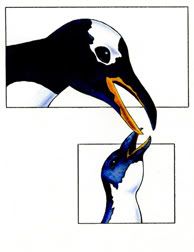
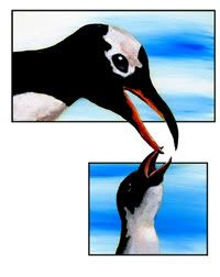
King Penguins in three panels
I did like how each one turned out - if I did this again (which I probably will...because I don't like how the backgrounds differ so much from piece to piece...I'd like that to be uniform...as much as possible...) I'd probably do the backgrounds all at the same time before I did the penguins.
The middle painting was the last one I did - and I did it on this brand new hot pressed watercolor paper that I just bought. There was just such a difference between the papers! That led to the paint laying down different (cold pressed watercolor paper has more of a tooth to it...which just means that it's a rougher paper - hot pressed paper is quite smooth...but this means that the hot pressed doesn't hold the water as long because there's less paper there to hold it...so it dries quicker)...and the color ended up being very different - even though I used the same colors in the same order on each painting. So - if nothing else, it was a learning experience that if you're going to do a series, don't switch paper types right in the middle.
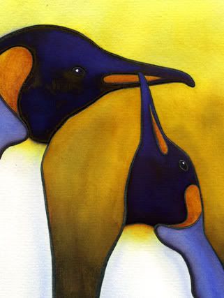
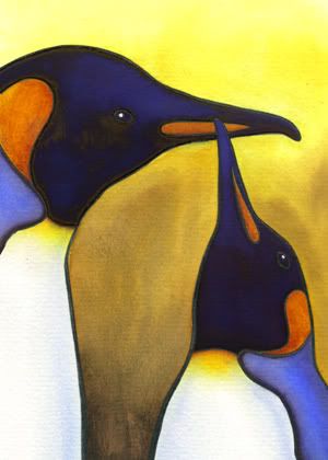
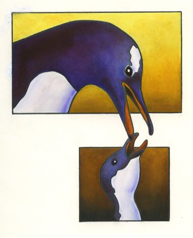
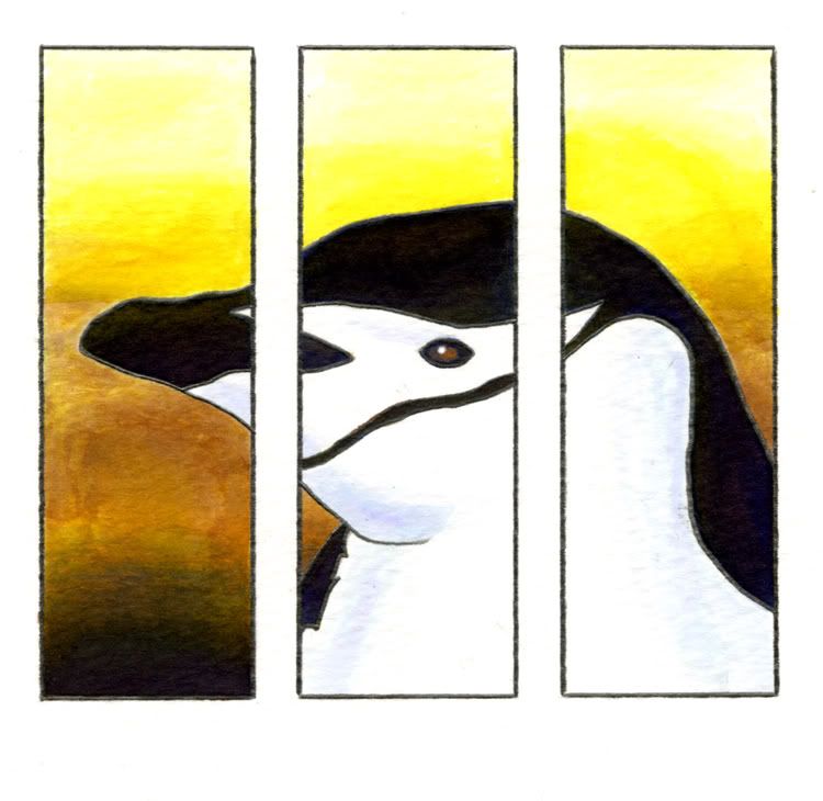
I also decided I'd like to do the same series with a yellow gradient behind them instead of the blue. This next one is the first in that series (I'm still working the background, and I'll post that when I'm completely done).
Photobucket - Video and Image Hosting
King penguins in yellow
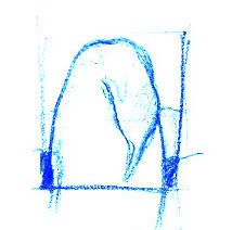
But because of this one I thought it might be better to do a series of with 3 panels - but one being a yellow painting, a flat graphic image, and then a blue painting...it'll probably end up looking something like this:
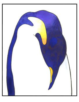
Photobucket - Video and Image Hosting
King Penguins
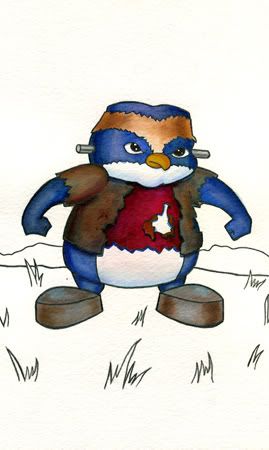
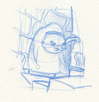
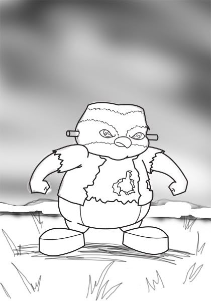
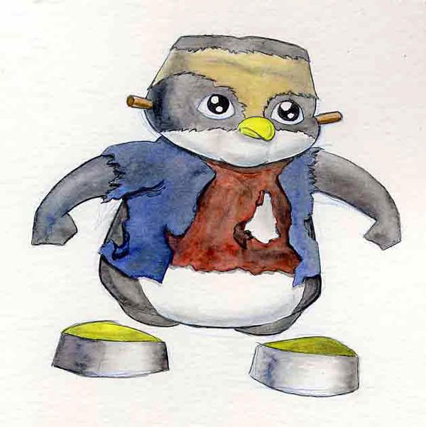
Anyway - that's all I have for now...I'm going to be working on the Frankenpenguin painting for the next couple of days...and I'll post that when I'm done...

Thursday, September 21, 2006

Gentoo Penguin painting

I've done the composition of this one previously - I thought the idea was quite genius - having two objects (in this case penguins) self contained in their own border and crossing over with just their beaks. I did it as an acrylic and again as a watercolor (this was late spring when I was first coming back to painting and I didn't know if I wanted to continue struggling with watercolor or struggle with acrylics...)...both turned out decently enough...but were kind of on the suck side. I was impressed with them both at the time because I was still learning (still am) and was impressed with how well I could do.

Photobucket - Video and Image Hosting
This was in my sketchbook as a thumbnail where I worked out what I wanted
And this is the first watercolor and acrylic painting I did. Both are quite about twice the size of the one I just finished (turns out I like working in watercolor, just very very small...makes everything easier to manage and manipulate)...

Photobucket - Video and Image Hosting Photobucket - Video and Image Hosting

Anyhow - The one I currently did was on hotpress watercolor paper...I'm still trying to figure out if I like that better (than coldpress)...if you don't know - the difference is that hotpress is very smooth and coldpress has a bit of texture (which varies depending on the brand of paper you buy). I also redrew the adult penguin because I didn't like the angle that he ended up being in the first - the profile was just too boring. So now his head is turned a bit and I actually looked at reference this time around - so he looks more like what a gentoo penguin is supposed to look like.
Photobucket - Video and Image Hosting
"Vomit sure does taste better coming from Mom"
Pencil and Watercolor

Wednesday, September 20, 2006

Igor the penguin

I was doing some thumbs of what I wanted the Frankenpenguin to look like and ended up going a different direction and creating an Igor penguin...so when I finish with my frankenpenguin I'm going to continue on and do an Igor penguin...who knows - if I enjoy this well enough, I might end up doing a whole series of monster penguins...
Photobucket - Video and Image Hosting

Frankenpenguin: an update...

I finished cleaning it up in illustrator. I took that into photoshop just so I could see if I could make a simple background around the character to give him some sort of context. Then I printed that out and transfered it to watercolor paper. I just finished cleaning that up with my 2b pencil and extensive use of an electric eraser...I'll try to paint it tomorrow and will probably have it finished by Friday. For now - this is the photoshop quickstudy...
Photobucket - Video and Image Hosting

Tuesday, September 19, 2006

Frankenpenguin

I'm currently working on this piece I call Frankenpenguin. I actually did this a couple of years ago while I was working at Nickelodeon...I was trying to get back into painting so I could have some finished pieces. And I've always hated watercolor but felt that I could work with it (and it's the easiest to use...but terribly unforgiving if you screw up. Anyway - this drawing I really liked - I was doing a series of characters that I designed as different classic horror movie characters. I did one as dracula, one as Ash (from Evil Dead 2) and this one...which was a slight take on Frankenstein:
Photobucket - Video and Image Hosting
I liked the color and everything - but didn't care that much for the pose - nor did I like that the character had no expression...but I couldn't do anything about it because it was already done...also - there was no background...so even though it was done, it still felt like it needed to be completed. This last Saturday I printed out the drawing that's been up on my myspace page since the beginning and dropped a piece of tracing paper on top to redo it...this is the rough - and today I'm going to spend cleaning it up (first in illustrator and then by hand onto my watercolor block) and paint it either this afternoon or tomorrow.
Photobucket - Video and Image Hosting
I think this one is a better drawing (a bit) in terms of character pose (he's no longer floating) and emotion (he doesn't just have a blank look on his face)...maybe years in the future when I'm an even better artist I'll come back to this and try again...but as for now...this is all I got!

Friday, September 15, 2006

Penguins: the beginning...

I'm currently on a haitus from work (which means I was laid off and I'm too lazy to look for other employment...and too proud for that matter - I figure if I wait long enough they'll come crawling to me!)

Anyway - on my time off I'm trying to devote a lot of time to painting and drawing. I've currently got a couple of ideas in my head - but this is what I've put down to paper so far...

And...I guess...as the time goes by I'll expand to include everything I've done - and not just penguins...as that's very one dimensional and even though that IS me, it's not the me I want to convey to all the strangers out there in Blog land...if nothing else, I want those jerks to think I'm cool...

This piece I've actually done several times - I wanted to paint me some penguins - but do the composition in a different, or at least interesting way - so this was one of my first experiments with that:
Photobucket - Video and Image Hosting
I did this quick study with black, white, and brown charcoal pencils...
From there I went on to paint it - I did it twice - once with a yellow background (http://i49.photobucket.com/albums/f270/meshaq2000/chinstrapbarswater.jpg) and the second one (which I prefer...which is why I just link the other one, and don't actually include it here) with a bluish/purple background.
Photobucket - Video and Image Hosting
This was a watercolor (using Dr Martin's concentrated water color) done on coldpress watercolor paper

And that's all I got for now...if anyone thinks anything I do sucks - please leave your loser comments to yourself. But seriously - if you think I can improve...please tell me why so I can correct any shortcomings and end up a millionaire all because of your free advice! Thanks in advance!
 
Free Hit Counter