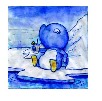
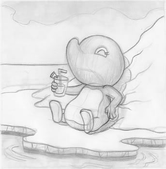
So this was based on a drawing I did about a year and a half ago. I was drawing in ink and then painting directly onto my sketchbook. It made for quite a few raggedy soggy pages. I was working all of my images at a specific size because they would fit neatly into these small frames I had just purchased. Well, it was an idea that never really went anywhere...but I always had this one drawing that I really liked.

I had always meant to redo it. I really liked the feel and composition, but it was always so rough. And, if you see any of my art (and the struggle I go through trying to keep brush strokes and texture) you'll know that everything has to be very clean.
Well (and please forgive the repost, but I was excited last week when I finally dug up this drawing and revised it)...I printed out the watercolor sketchbook piece (lowering the opacity so I could see my revised lines) and made the drawing better:


And, of course, I cleaned up the lines in Illustrator and then transfered it to photoshop.
Lately I've been developing a few ideas for my next Adelia book. I think this one will have a lot more of a painterly look to it (as painterly as I can get it using Photoshop). And this illustration really would fit in with the current direction I'm going.


2 comments:
What a great relaxed expression she has!...
nicely done, love the detail on the side of the ice floe
Post a Comment