Monday, December 29, 2008

New character closeups....

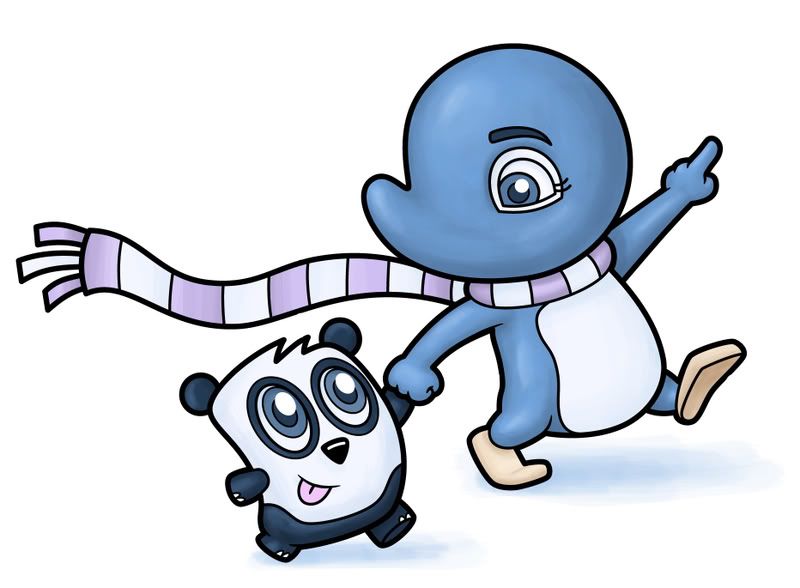
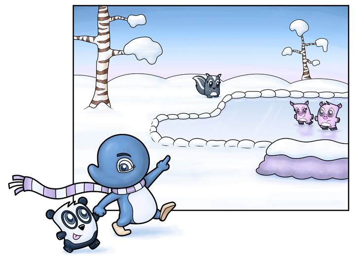
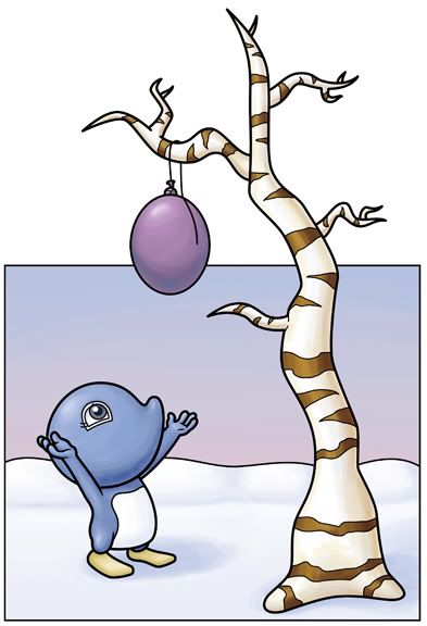
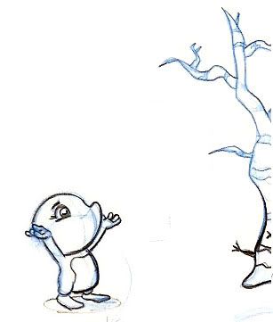
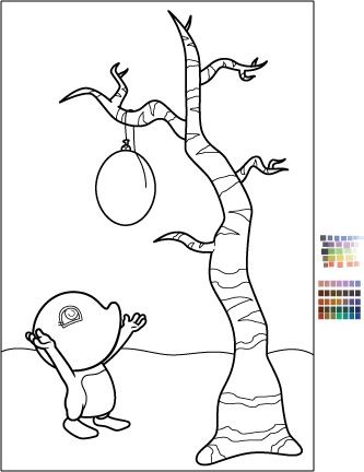
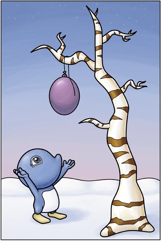
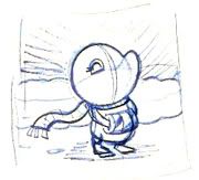
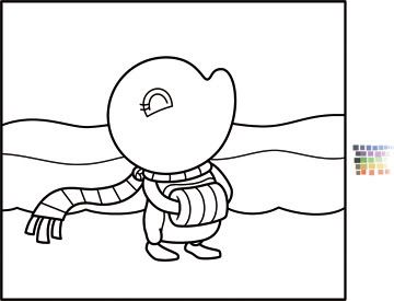
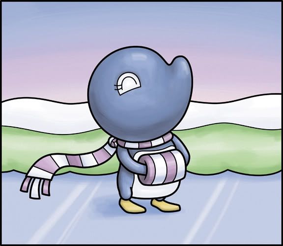
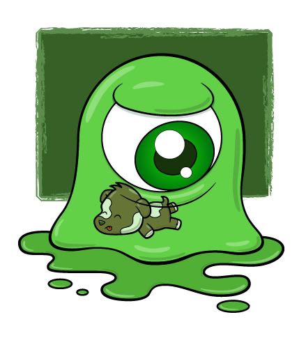
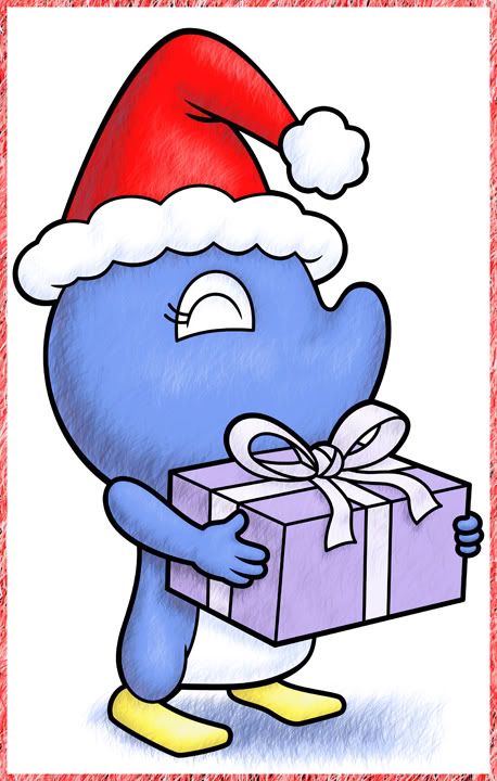
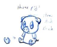
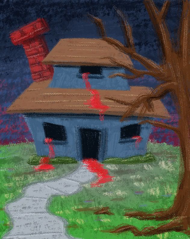
I did this illustration of Adelia and a panda walking by a snowy winter scene. These were the characters in the background. They're based on little toy designs I had thumbnailed.


Photobucket


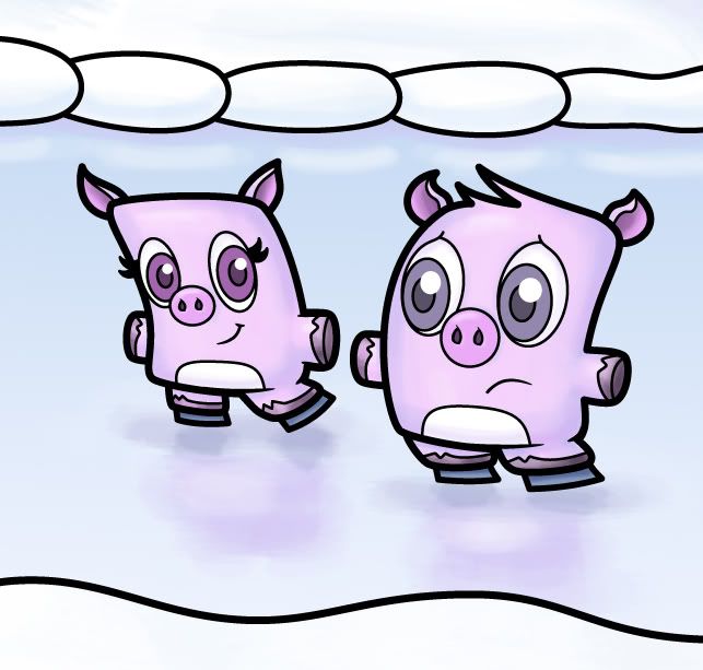
I did add small stubby arms on a couple of the characters (the panda, and the pigs) to make the scene work better. I liked the idea of the pigs skating and the little boy pig scared and trying to stay upright.


Photobucket


I was trying to develop the illustration so that way each of the different elements/characters could all be a self contained drawing. I think they work quite well individually, but when I look at the entire picture, it seems a little empty...


Photobucket

But that's why I seperated them, so individually they can be enjoyed as (hopefully) solid drawings.

Sunday, December 28, 2008

IF: Clandestine - Adelia sneaks about...

The first thing one will do when looking at the Illustration Friday this week is wondering just waht is clandestine. There's a good chance you've heard of the word, you might even be leaning towards a particular direction as far as figuring it out. If you're a nerd, it kind of sounds like some sort of group that must do something (D&D style) - a clan destined for...? And you'd have to roll the dice (24 sided usually).

Maybe it's seafood related - but then that would be clamdestine...in any case something smells fishy.

And it ain't this post - I just looked it up. I could have looked at the other entries this week (which I'll do in a minute, but now that christmas is over, I have time to post something)...

clan·des·tine (kln-dstn)

ADJECTIVE:
Kept or done in secret, often in order to conceal an illicit or improper purpose. See Synonyms at secret.


Photobucket

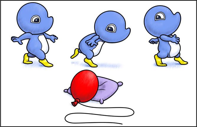
So this is a piece I did. It's Adelia sneaking away from her balloon friend. It was sort of my transition piece away from my first Adelia book (still unpublished). It was about Adelia and her red balloon - but neither Adelia nor I wanted to bog her down in trying to find a way to fit the balloon into every Adelia drawing....so she's leaving the balloon behind.

Wednesday, December 24, 2008

Adelia - Walking with a panda

Photobucket


This is the latest illustration I've done.
Photobucket
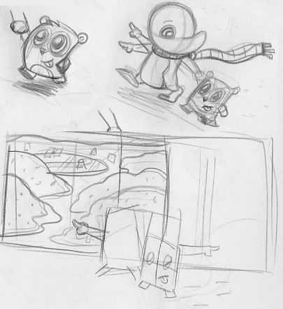
I started with several small sketches - I wanted to make sure of the direction and composition.  As you can see - I have the two characters pointing in both directions, because I wasn't sure (at first) where they should be.  I did know I wanted them out of the frame...

And I redrew the panda character a couple of times to make his walk more natural and cute.  The panda and the other characters in the illustration are based on some vinyl toy designs I drew.  I want to expand Adelia's world to include more than just her and a balloon, so I thought this would be a good way to introduce more characters.


Photobucket

Sunday, December 21, 2008

Adelia and the balloon take 2

I basically just redid the boarder on the piece. I'm toying with which one looks better. I like the idea of some of the composition going out of the frame...but on the other hand, the sky in the full version looks complete...anyway - I have both versions...let me know if you think one looks better than the other...

Photobucket

IF: Voices - Adelia and the balloon

So...I have this character (Adelia). This is a scene from the first book (unpublished...so far). I was just sketching and it came out well enough that I had to finish it up.

Photobucket

The character expresses all of her emotion and feelings nonverbally. Her voice comes from her body language and eye (her nose is big and upturned, which always obstructs the other side of her face, even in three quarter view).

I'm currently working towards building up a bunch of Adelia illustrations in order to put together a portfolio. My goal is to either set a meeting with publishers, editors or art directors.


Photobucket

This is the second piece where I picked out all my colors ahead of time in Illustrator and then transported the whole thing into Photoshop (ctrl-c in illustrator and then ctrl-v in photoshop).

Once again I colored it in photoshop where I set the brush at 30% opacity and the flow at 100% (which is the opposite of how I usually, or used, to color it - with the opacity at 100% and the flow at 1%. That's right, one). I think either way is a good way to color...I end up getting enough texture in the piece both ways...And so far, I've enjoyed working the piece both ways.

Photobucket

Adelia's merry christmas season

I've done several drawings now (in the last week) of Adelia in this very similar pose:

Photobucket
So I felt like I had to finish it up and paint it. I cleaned it up in Illustrator. I also grabbed a bunch of colors that would match well together (if you see the small swatches) which would make it easier to color when I sent the image to photoshop:
Photobucket
And then I took it into photoshop. Now recently I've been really in love with the Gaussian Blur filter. This tool definitely has it's purpose, but what I've been doing recently is roughly laying out the gradients of my character and then using a large dose of gaussian blur (usually around 15 percent or so) which completely takes out all the lines and brush strokes and leaves a very smooth gradient of color. One problem with doing it this way is that the objects you've blurred tend to ghost around the edges (because it blurs out to white)...of course I always go back in and recolor everything - this way I have some brush stroke, but also a very smooth transition of colors. The problem this time around is that I did it too much. And the final result was just too photoshoppy. I feel thats the worst thing to do when painting in photoshop, is to make it look like you've done it...so my gaussian blur technique (which worked well on the Adelia in space piece) might be retired early (or I'll just use it a little more sparingly). I was probably falling in love with things getting a little too smooth.
Anyway - so I did the color and decided I hated it because of the gaussian blur and how smooth everything ended up. As well as all the darks were too dark and there were no midtones. basically there were a lot of problems...so I recolored it. And this time I did it the way I've heard a lot of other artists paint in photoshop. This is my first 'finished' illustration using this technique. Basically when I paint I keep the opacity (of the brush) at 100 percent. And I lower the flow to 1 percent. that way I can slowly build up the color and gradients. What I've been reading recently is that a lot of people do just the opposite - they lower the opacity (to around 30 percent) and keep the flow at 100 percent. So that's the way I did this piece. It was tough because I love the smoother look, but I've been trying to add brush strokes to my illustrations - because even though my brain is telling me to cover up the strokes, I know that it looks better.
So this is the final illustration:
Photobucket

Wednesday, December 17, 2008

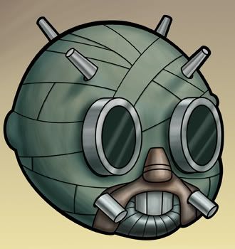
IF: Voices - lil' Tusken Raider

Photobucket
It's hard for me to think of the lil' sand people (tusken raider, if you prefer) without hearing Obi-wan's voice.  "The Sand People are easily startled but will return in greater numbers...."

And if you really liked the movie (and seriously, who didn't?  Well, up until the last three were released anyway) you'll probably also remember this, "These blast marks are far to accurate for Tusken Raider's ....these were made by Imperial Storm Troopers..."

Alec Guinness had an amazing voice.  Along with James Earl Jones (Darth Vader) they turned the possibly corny dialogue into something riveting and believable.

Well...enough about this star wars (sci-fi nerd talk) and back to my illustration (arty, comic book, animation nerd talk).

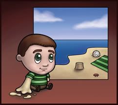
This is my 4th version of the Sandman.  In the very beginning I was just going to do a version of Spiderman's nemesis The Sandman:
Photobucket
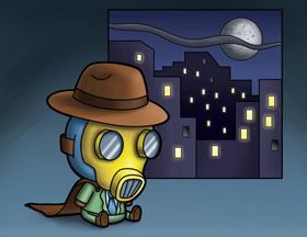
But as I looked online for reference I found several other characters in the comic book world also with that name.  There was one from the golden age of comics:

Photobucket
He wore a gas mask and shot a gun that put people to sleep (much like my story here).  When I saw him I just had to do my version of him.

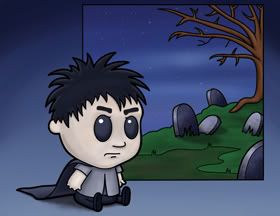
And the character that dominated the search engine when you typed in Sandman was this guy:

Photobucket

Now I don't think his name is The Sandman (so maybe drawing him was a bit of a stretch) but he's in a comic book called The Sandman...I believe his name is Morpheus.  But what's say we count him, eh?

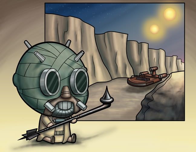
Anyhow - As I was putting my Sandman obsession to sleep, I was suddenly struck with the thought of the Sand People from Star Wars.  If you took just one of them, you could very well say he was a Sand Man (but most people would probably call him a tusken raider).  And, of course, I had to draw him.  This should put to rest The Sandman saga.  It ends with this 4th and final illustration:

Photobucket
What was nice about this one (which makes it slightly different than any of the other drawings I've done in this series, and not just sandmen, but all of these illustrations) is that I drew it completely on the computer.  I did the original sketch on a cintiq, cleaned it up in Illustrator, and then painted it in photoshop.

Monday, December 15, 2008

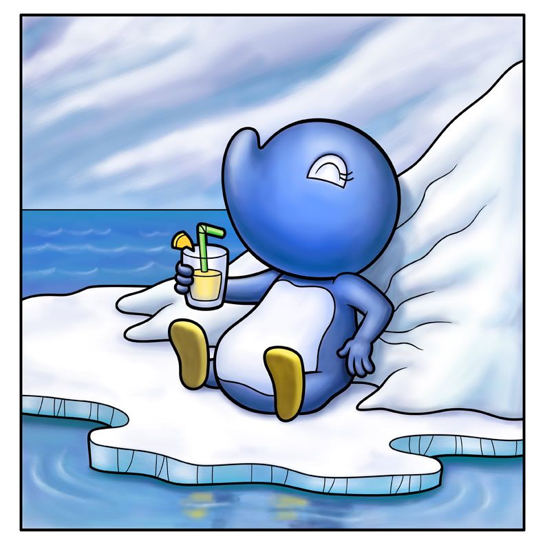
Adelia takes a drink...

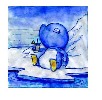
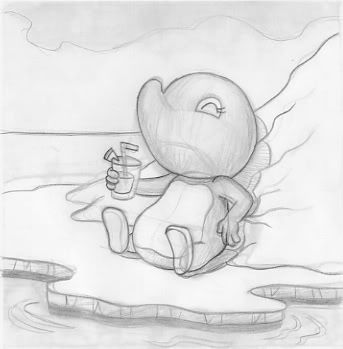
So this was based on a drawing I did about a year and a half ago.  I was drawing in ink and then painting directly onto my sketchbook.  It made for quite a few raggedy soggy pages.  I was working all of my images at a specific size because they would fit neatly into these small frames I had just purchased.  Well, it was an idea that never really went anywhere...but I always had this one drawing that I really liked.
I had always meant to redo it.  I really liked the feel and composition, but it was always so rough.  And, if you see any of my art (and the struggle I go through trying to keep brush strokes and texture) you'll know that everything has to be very clean.
Well (and please forgive the repost, but I was excited last week when I finally dug up this drawing and revised it)...I printed out the watercolor sketchbook piece (lowering the opacity so I could see my revised lines) and made the drawing better:
           
And, of course, I cleaned up the lines in Illustrator and then transfered it to photoshop.  
Lately I've been developing a few ideas for my next Adelia book.  I think this one will have a lot more of a painterly look to it (as painterly as I can get it using Photoshop).  And this illustration really would fit in with the current direction I'm going.

Sunday, December 14, 2008

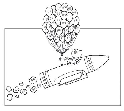
Adelia Takes Flight - now with balloons!

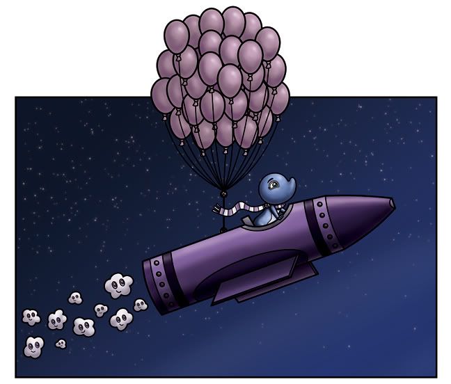
This is the second version of this painting. It was a pain (!) to take out the balloons from the other drawing.

I also went a little nuts trying to figure out the color for the balloons. If you know Adelia, you know she has a little red balloon - so the original colors I laid in were of this massive blob of bright red. And, because there's no red anywhere else in the picture (somehow the picture ended up being overwhelmingly violet...I guess I blame the crayon...) it just stood out and took over the composition. Anyhow - I ended up choosing a million colors before settling on this pinkish purple. I quite like how it turned out.

The only thing I don't like about the other composition was how I had to enclose the frame. I liked the idea of the balloons extended off the page.

Photobucket
And, if you notice - I added the faces back into the little clouds. I liked them in this one because it made the smoke coming out of the back of the crayon less urgent. I wanted it to look like more of a casual ride where the balloons are taking the crayon for a stroll. Or something...

IF: Rambunctious Adelia takes flight

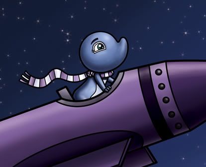
Here's a closeup of Adelia:

Photobucket

The last few weeks I've been spending a good part of my Saturday afternoons at the bookstore. For some reason it's been a good way for me to get some drawing done.

This last Saturday (that would be yesterday) I was working on developing the world of Adelia more. When I first attacked this project I wanted it to be very minimal in extra detail and backgrounds. My first Adelia book was done completely in that style. But now it's been about a year and a half that I've been drawing this character - in that time my style has been evolving and Adelia is a good part of that.

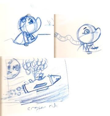
The original sketch shows a lot more info than what I eventually put in. I wanted the crayon ship to be more of a rocket...which meant the balloons were out of place. I think, if time permits, I'm going to do a version of this with balloons (which means doing it without the smoke).


Photobucket

I also eventually opted out of using the moon. I felt it would take away from the composition - and it was just loud and clunky, and didn't really fit.


Photobucket

In the rough I did a couple of versions of Adelia - one where she was in profile and the other where she was in a more interesting and dynamic pose (I went with this one in the cleanup). If you notice, there are a lot of faces on everything. in the rough the crayon had a pig face (because of the snout like tip)...I'm still toying around with the idea of having everything be alive and a character all on it's own. Obviously it has Tokidoki feel to it (there are many illustrators using this, and I got into it through researching for a freelance job for Kitson and Nikki Chu handbags - they wanted a series of illustrations in the hello kitty, tokidoki, gwen stefani style). It's a direction I'm exploring as it lends itself quite well to toys. But we'll see...I don't think i'll go so overboard as to put a face on EVERYTHING. But we'll see...


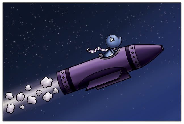
And here's the final illustration:


Photobucket
And I created it for Illustration Friday - Adelia takes a rambunctious ride through the cosmos.

Friday, December 12, 2008

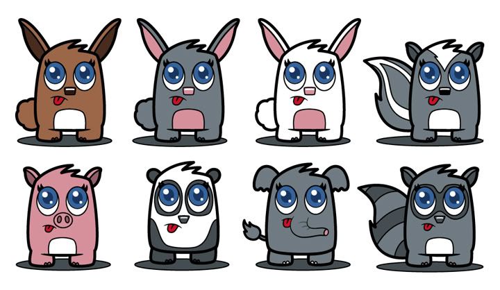
More cute little vinyl toy designs

I wasn't done working on these. Here are 4 more. I tried to do a cute little whale, and I was having a heck of a time with it - it just did not look right! And then I realized that it was probably because whales don't have feet...


Photobucket

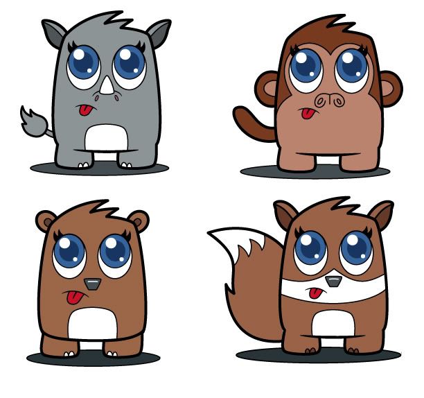
Cute little vinyl toy designs

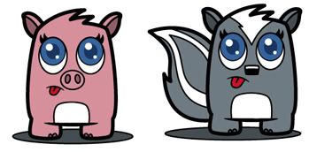
I did these today. More little toy designs. I've been spending my nights trying to sculpt Adelia, and the going has been quite rough. With this in mind, I thought I'd do something simple - cute toys with no arms and even stubbier legs. I think the eyes need a little work (they could be cuter)...but these were just the first few that I could think of.


Photobucket

IF: Rambunctious

Illustration Friday once again. Shame on you if you're not participating! You could do like I'm going to this week and post two old illustrations. Now they're not drawings I've posted before on my blog, so I feel like it still counts. And they're in two different styles.

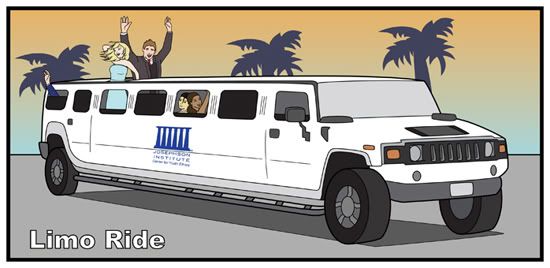
The first is this - a Rambunctious limo ride to the big awards ceremony:


Photobucket


I did this illustration for a board game for The Josephson Institute. They're a nonprofit company devoted to helping kids in an education and fun way. If you're terribly interested, you can view more illustrations from this game and many other things at my portfolio site.

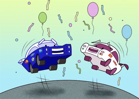
The second picture is this: A Rambunctious car party


Photobucket


This was also a freelance project that I did for Astrella Celeste. She's the daughter of the folk rock legend Donavan. Ms Celeste was creating a project that would combine reality television with charity - in hopes that it would make a lot of money for a variety of needy charities. The part of the project I was working on was a children's book of sorts - her team wanted to use this in the pitching of the project...Basically the story followed these two cars as they interacted with the different steps that the project entailed. This picture is the big party at the end of it all when they celebrate all the hard work finally paying off.

Thursday, December 11, 2008

Adelia: Happy Christmas in watercolor

This was originally going to just be a watercolor piece - but I got to posting the photoshop version first.


Photobucket


I've always drawn this character in very simple poses doing very simple things. And I think it works perfect for her.

I've also started my watercolor paintings a different way. I used to do a sketch and then scan it into the computer (as opposed to the refrigerator, which usually resulted in a salad) where'd I'd clean it up in Illustrator and then print it out again. I'd take some graphite and rub it on the back (in order to transfer the drawing to the watercolor paper). Then I'd tape it down to the watercolor block I was using and trace the lines. Because of the graphite on the back, you could see all the ones I traced on the watercolor paper. I'd then darken in all my lines and erase when needed.

Most recently though (on this Adelia and on the two blob monsters) I've been drawing my roughs in light blue pencil on the watercolor paper and then, using an electric eraser, erasing the blue line as much as possible - And when I used the graphite pencil (.9 mm), it hides all the blue lines...and whatever the graphite doesn't cover, I can always erase.

Anyhow - it makes for quite an easy start to the painting...because when you want to paint - you should be able to paint - the less time fiddling with lines and computers, the better!

Wednesday, December 10, 2008

I need a name for this thing!

What does one call their toy line, or line of drawings? I could just go with the art of Isaac Marzioli...but that's kind of lame. My first thought for my blog was 'blah blah blog' - but the only reason I had that in my head was because it's a game they play on the Adam Carolla show.

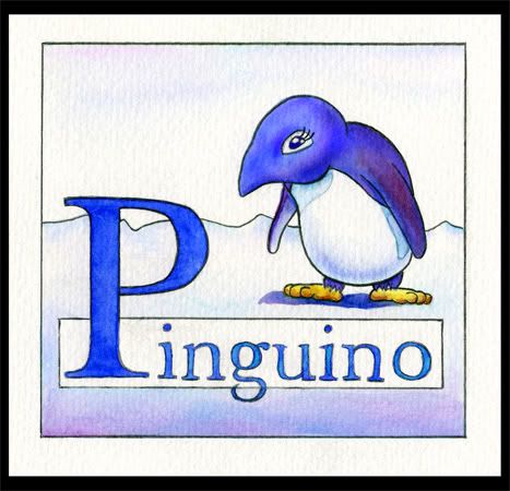
Back in the beginning this blog was dedicated to the penguin pictures I was either drawing or painting - it was a simpler time. I had a name - the boring penguin blog. It sounded terrific to me. I loved penguins (still do) and I know everyone else was getting sick of hearing about them and seeing me draw only that one subject.


Photobucket


There was quite a lull in the production of penguin drawings - and what took it's place was my freelance work. From there I started developing as an artist, and what I was drawing started to vary.


Photobucket


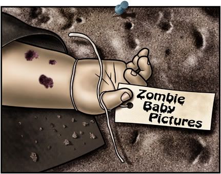
At one point I was thinking of doing a t-shirt line or some form of merchandise - and i drew this picture:


Photobucket


It seemed perfect - and it was a bit of cute (which is what I draw) with a bit of macabre (which is the twist to my cute drawings).

So eventually I changed the name of my blog to Zombie Baby Pictures...but it seems to be lacking. Doesn't it? What I'm afraid of is that people see zombie and will automatically assume it has to have zombies in it. Fleshy decay and brains being eaten. But I was trying to be figurative with the use of zombie.

Anyway - If someone happens to read this - and can think of a word or phrase or something that would sum up my art or a possible toy line based on my drawings, then feel free to share it. I'm working on a couple of ideas, but nothing really screams out at me like Zombie Baby Pictures...or the boring penguin blog...

Eaten: Blob vinyl toy design #2 vector style

I already posted this drawing yesterday. But this version is the illustrator (vector) version. If one is to send designs to a company, it's probably best to have the lines as crisp and clean as possible. This, of course has all sorts of highlights on it, so it too wouldn't work, but I wanted to give the illustrator version some depth, and also make it look like plastic.

Photobucket

I have also been looking at my watercolor versions and really felt they needed some sort of color behind them. So this kind of fixes that problem as well as (kind of) tying it in to the other drawings I'm currently doing - the little kid entertainment icons.

Tuesday, December 09, 2008

Eaten: Blob vinyl toy design #2

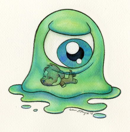
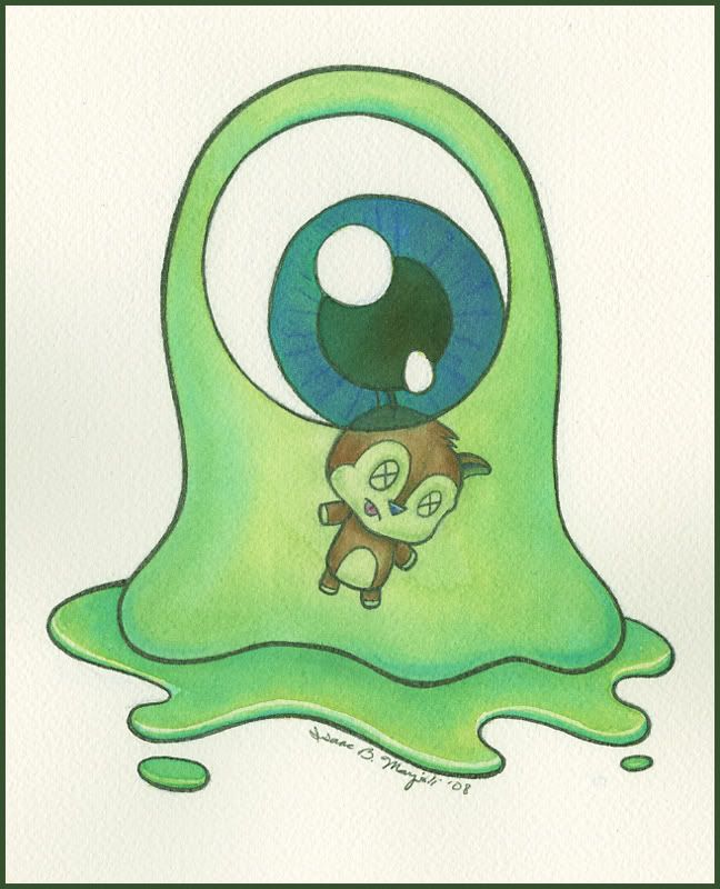
This was the other design I did. I think these things would make fantastic toys. I like the idea of different types of blobs as well as different cute dead animals in their see through stomaches. I'm currently researching the process on how one goes about, not only designing a toy, but manufacturing one. Eventually I'm going to put together a pitch and see about having a company fund my toy designs, but I'll have to struggle through the learning process myself.

I'm going to get some clay and see about sculpting one or some of these toy designs in the next couple of weeks...so stay tuned for that!

Photobucket

I have some freelance projects I'm working on, so I'll have to put this stuff aside for a little while and concentrate on that. But I'm hoping to get to some pretty big things (as far as toys go) in the next year. We'll see how it works out.

Monday, December 08, 2008

Adelia: relaxing in the sun

This is a revised version of a really old rough painting I did in my sketchbook a couple of years back. I was obsessed (at the time) with doing small 5x7 drawings that could easily be framed and sold. I did a bunch of Adelia drawings in my sketchbook and watercolored them. This is the one that turned out the best:

Photobucket

I had always meant to tackle it again and repaint it for real (not in my sketchbook). But I never got around to it...until this last weekend. I printed out the watercolor lowering the opacity so I could see my revised lines easier, and then drew over the printout. I'm going to clean it up in Illustrator when I have a chance, and then repaint it.

Photobucket

It's very similar to the original - but there are key differences - small bits of perspective, and I changed the hands (because my hands were a little weak originally) and I changed her pose so her body is under her head. I just can't wait to tackle it...

Sadly, it'll probably take a little bit of time as I have many (art related) things on my plate currently...

Eaten: Vinyl toy design

I was reading a computer arts magazine at the store on Saturday. The entire magazine was devoted to vinyl toys and their creators. Apparently it's a great way to create buzz for your art and it's cheap and quite possibly profitable.

Now - this isn't something I can jump into right now. But it got me thinking that this was a direction that I would love to go. I have my little character Adelia - Photobucket who would lend herself quite well to this concept...of course they toy needs to be simplified, to an extent. The more complex the figure, the more the fabricating would cost.
I went back home and started looking up vinyl toys and how to manufacture them when I came upon the Vinyl Toy Network. Apparently it's a convention that's held every year (maybe even twice a year) in Pasadena. And, luckily for me, it was happening the very next day!

I went to the show and had a blast. There are so many talented artists showing off all sorts of crazy toys. From tiny zombies you can paint yourself to cute animals smoking cigarettes - there was even a cute girl toy with a hat made of poo with wings. I was looking for presents for christmas, so I was on a limited budget for myself. But I was able to pick up a Captain Coco special edition from Tokidoki and a Kathie Olivas Scavenger toy. I also bought an art book by Ragnar who had a table selling posters and original art. He's incredible, and if you don't know his art style - you should check it out - http://www.littlecartoons.com/index.html

Anyhow - After the show I was quite stoked. I'm going to go out and purchase some molding clay to sculpt an adelia toy. And, dreaming about the future, I drew and painted (in watercolor) a toy design that I created. It's probably a bit complex considering one has to watch one's budget when starting out in this field, but this is where I'd love to take it, if ever the chance presents itself.
Photobucket
it's still a very simple design, mostly - a big blobby monster type. But what complicates it is that I want the monster to be openable (bisected) and another, smaller, toy is lodged inside. Put together, it'd make quite a cool looking little toy - a see through blob monster who just ate a cute little animal.
Friday, December 05, 2008

Adelia: Happy Christmas!

This year I had it in my head that I should do at least 3 postcards for promotional purposes. The first one I sent out was around February and was Adelia holding a heart - kind of a valentine's day theme.

The next one that went out was around August. I had just finished doing the cover for a children's book called "Zebra Berries For Mommy" and I had to show off that illustration. The biggest reason was that it wasn't a penguin! I was as shocked as everyone else that I could draw another animal character other than a penguin.

But I couldn't give up on Adelia - so for my 3rd postcard (that I would send to children's book publishers) was going to be a christmas themed illustration. This is my first attempt. I'm getting a little worried as it's getting really close to Christmas and I still don't have a final image (This one would work...but I want something more...I did some sketches of Adelia peeking around the bannister of her house on Christmas morning looking at the christmas spread - the tree, presents, fireplace. I'm hoping to get this one finished...). Anyhow - this is just a fun little drawing of Adelia (that probably won't be used for any other reason than to show off how cute the character is).

Photobucket

Photobucket

IF: Similar...The Three Little Pigs

For Illustration Friday I decided to post my Three Little Pigs illustration.

Photobucket

It's a story we all grew up with - and it's the first of the zombie baby picture subject matter I chose. There's the bumpkin pig with the straw house, the flighty pig with the stick house and the smart farmer pig with the brick house. The way I've always seen these pigs drawn was exactly the same - similar in every way except the way they dressed. So that's how I went about this drawing, they're triplet pigs, with each sporting a unique style.

Photobucket

Thursday, December 04, 2008

Back home and dead tired

So I decided to add something to the house. I desaturated the red of the chimney (so the other red would shine out) and I desaturated the green of the grass around the house...it get's more vibrant the further it is away from the house though...

So this is version 2 of the house...possibly a little more interesting...

Photobucket

kind of looks like it's in pain...or at least that it's tongue is sticking out...

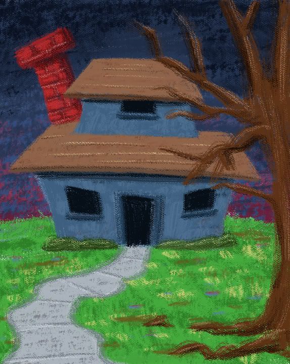
Home sweet Hell...!

I thought that title as I was uploading the picture. Very lame, I know.

The house occurred to me earlier today and I was annoyed that I didn't have any time to draw it. Since then the picture faded a bit...the idea ended up being very cold...barely in my head anymore. But I had a sliver of an idea...and I wanted to do a quick sketch of it. I'd say it didn't turn out exactly like I wanted it to - it's not terribly scary. But it conveys the anger in the style I was working with. I was getting annoyed as I worked on it though because I like putting in details - and doing it in this style made it very hard to include any sort of detail.
Basically the sketch ended up turning into a painting (in photoshop, of course). I really liked what I was doing (the painting, not necessarily the subject matter)...and I was missing how, when one paints with acrylics, it's more about layering colors than blending (there's blending, of course, but I learned it more as a layering process). Somehow I ended up with a grassy green lawn, when it should have been ugly and dirty and weeded. But I liked the way the texture turned out...so I went with it.

Anyhow - it was as fun little drawing...sadly, since I was doing it as a sketch, it was done at 72 dpi - meaning that it'll die here as a blog entry and nothing more...

Photobucket

Wednesday, December 03, 2008

Sand people: easily startled lil' sand kid

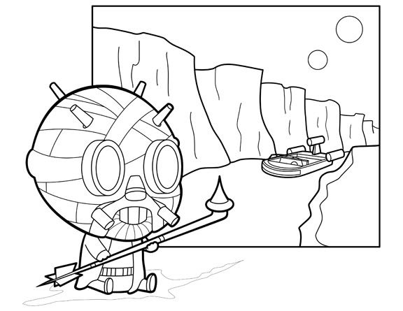
This is the cleaned up version of the sand kid.

Photobucket

I'd love to color him now - but I have work to do. I should be able to get to it by this weekend, at least.

Tuesday, December 02, 2008

Tusken Raiders: Lil' sand person

I can't believe I forgot to draw the sand people when I was doing my sandman series. I have three separate drawings devoted to different characters named Sandman - but didn't draw a sandman from Star Wars!

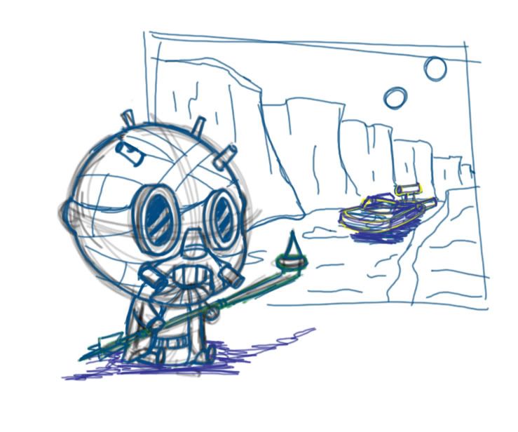
So, once I finally figured out my mistake - I went about trying to rectify it. Here's my sketch...I still need to clean it up (it's very rough...I drew it on the computer using a cintiq! All of the other drawings I've done in this series have been done in my sketchbook and scanned into the computer for cleanup), but it's a start!

Photobucket

Obviously I'll be posting the final illustration when I have time to work on it.
 
Free Hit Counter