There was also a portfolio contest (which it seemed that every attendee submitted a port for) and a postcard contest which I counted 23 entries.
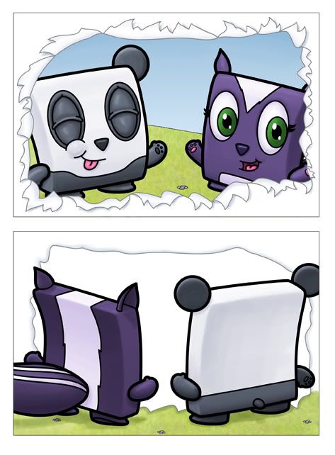
This was my postcard:

I thought it was a great idea (that my two main characters were bursting through the front of the card and on the back you could see the exactly what it would look like if you could actually flip the illustration over)...but the execution was a little lacking...it felt like there was something missing and I ended up not having time to finish it before the cards were due (back in October). Also, my original concept was that I would actually tear open a piece of paper and scan that and put my characters behind it...only to find that I couldn't tear the page to look enough like it should (like in the drawing above).

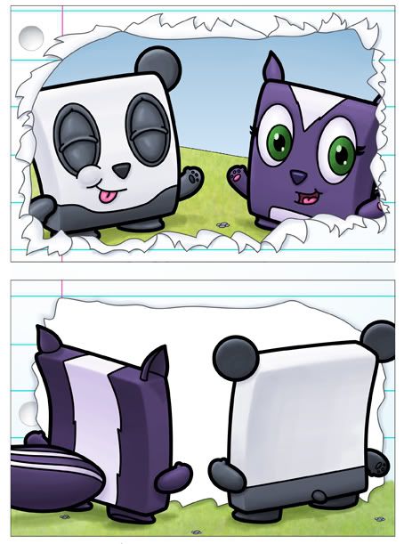
In the couple of weeks from the due date of the postcards to the conference I was able to finish another version of the cards - this time adding the look of lined paper (created in Adobe Illustrator for Shutterstock). And while this definitely helped add some interest to the piece, it still feels like it's missing something. Ideally it'd be nice if there was some sort of mirrored picture on the back of the postcard so when you flipped it over you'd actually see the back of them, but also what they're looking at (which would be you) so you'd also see yourself. This postcard won't be complete until I can accomplish that and kind of blur the lines between reality and lame postcard contests. Of course it was only lame because I didn't win...but I entered a postcard I wasn't completely happy with, so it was also expected.
From the event I learned that postcard mailers do actually work. This one girl (who did win) did a postcard that actually folds out into another (and bigger) picture, and then even folds out to an even bigger and full sized illustration. What's smart about her mailer is that each picture relates to the same story as the last and inside, when the postcard is all unfolded is another, smaller return postcard. Does it do the job? Who can say yet, but it's a very cool and different idea. I also learned that Chad Beckerman, the art director at Abrams only wants to see postcards and, like many art directors, uses that to look up new talented artists - but doesn't want to see bigger or more extravagant mailers (portfolios or anything more than a postcard) because he feels like he can get enough information from a postcard so anything else is a waste of time and money.
5 comments:
Great information, thank you for this post! And I think your postcard is pretty successful with the paper treatment (the lined paperstock)...very cute characters!
Hi Isaac,
Thanks for your comment on my blog! I'm sorry I didn't get a chance to chat with you in person. Loved being back in LA -- I used to live in Burbank before I moved to the desert.
Wow, Your Postcard looks so cute and colorful. Great work. It attracted me a lot.
Post a Comment