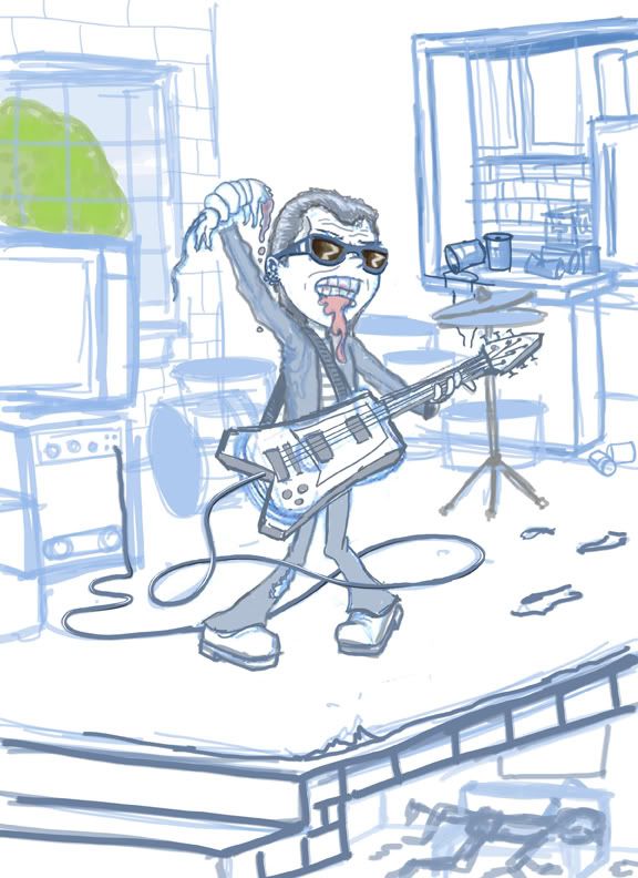
Here's the second version of this character. My sketch is a little more realized after talking with the client. He wanted an older rocker and less of a stage setting than a loft. So I entirely changed the background. I probably should have just finished this drawing up and sent it off as a final rough, but I enjoyed drawing it, and I really like this client, so I thought one more (possible) stage of revisions wouldn't be so bad.
Sunday, November 08, 2009
Subscribe to:
Post Comments (Atom)

1 comment:
what a fun and lively piece, this guy is a rocker and I bet he has the music reallly really loud.
Post a Comment