Prints are available at Etsy - http://www.etsy.com/view_listing.php?listing_id=34594454
Sunday, November 15, 2009
Saturday, November 14, 2009
IF: Unbalanced...in the head.

You'd have to have some sort of brain imbalance to attempt sky diving (or bunjee jumping or deep sea diving)...but yet people do it all the time. In this case it's four little animals. And they're all crazy.
This is my second pass at the illustrator clean-up. I still need to print it out (for a second time) and revise it before I can set about coloring it.

The major difference between this one and the previous cleanup is the addition of the fox character being yanked back up from opening his shute.
EDIT: the finished illustration is in the next post...
Wednesday, November 11, 2009
Falling with style
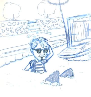
 I don't know why I keep drawing this character falling...
I did this quick sketch about two weeks ago and I really liked how it looked...the angle and such...it looked quite nice. And I guess he's diving rather than falling...but it amounts to the same. I should probably do both drawings because they sort of relate. He could be hanging out in the park with friends, and thinking about doing such dangerous and fun things...while the actual skydiving could be a dream sequence. Or something.
This is the quick cleanup of the above drawing:

The way I usually work is that I do a thumbnail (or, at least, a really small drawing) in my sketchbook and then scan it in and do a rough cleanup in Adobe Illustrator. I print that out and make revisions, rescan it and re-clean it up (and sometimes, if it's still not looking right, I"ll print it out a second time and have another go with revisions)...and then I color the hell out of it in Photoshop. Anyway - I'm still at the beginning stage of this illustration....
Labels:
panda
Monday, November 09, 2009
Rock out with your ---- out...
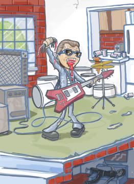
I've never understood that saying. I guess it rhymes with rock...it doesn't sound like what one would be doing if they really were rocking out. It's more the stuff of sickos and perverts...but everyone has their own passions, so if this one is yours, at least make sure the women and kids are at a safe distance before you start whipping it about.
Anyway - this is for a client - they wanted a rough color drawing to go with a pitch. I can't talk about what the project is, so as to maintain the integrity of the idea. It does kind of blur the line between reality, exaggeration and cartoon.
It was kind of strange working so rough...and a bit hard using a wacom to trace line art in photoshop (I'm used to doing it in Illustrator, or at work on a cintiq)...but while there was a lot of ctrl-z action, I did manage...
Sunday, November 08, 2009
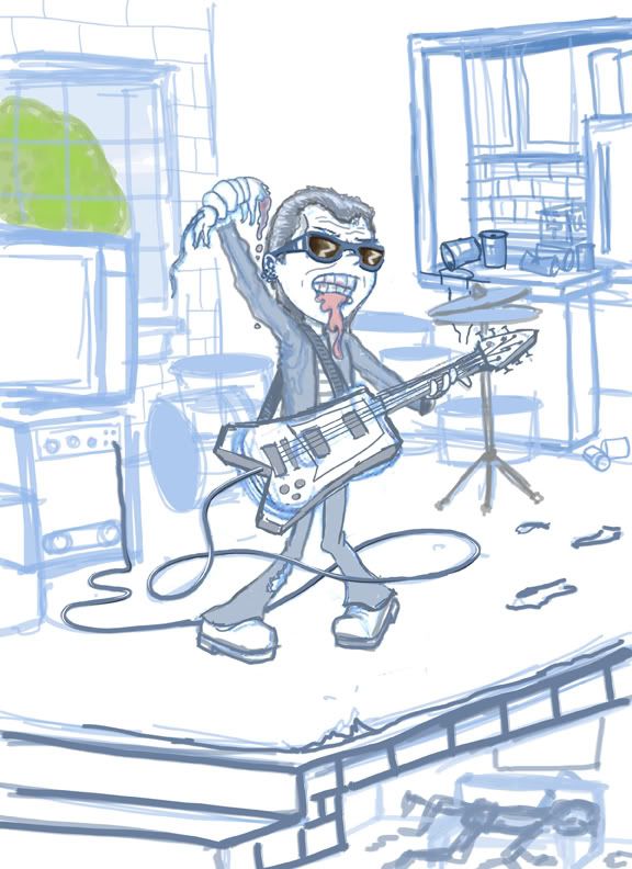
If it's too loud...turn it down.
Here's the second version of this character. My sketch is a little more realized after talking with the client. He wanted an older rocker and less of a stage setting than a loft. So I entirely changed the background. I probably should have just finished this drawing up and sent it off as a final rough, but I enjoyed drawing it, and I really like this client, so I thought one more (possible) stage of revisions wouldn't be so bad.
SCBWI postcard contest
So yesterday I was at Illustrator Day in San Gabriel. It was a small event with several good speakers who talked about the children's book market.
There was also a portfolio contest (which it seemed that every attendee submitted a port for) and a postcard contest which I counted 23 entries.
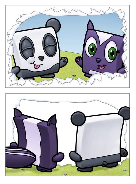
This was my postcard:
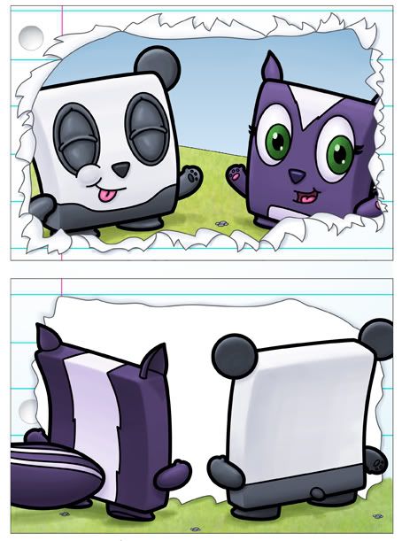
In the couple of weeks from the due date of the postcards to the conference I was able to finish another version of the cards - this time adding the look of lined paper (created in Adobe Illustrator for Shutterstock). And while this definitely helped add some interest to the piece, it still feels like it's missing something. Ideally it'd be nice if there was some sort of mirrored picture on the back of the postcard so when you flipped it over you'd actually see the back of them, but also what they're looking at (which would be you) so you'd also see yourself. This postcard won't be complete until I can accomplish that and kind of blur the lines between reality and lame postcard contests. Of course it was only lame because I didn't win...but I entered a postcard I wasn't completely happy with, so it was also expected.
From the event I learned that postcard mailers do actually work. This one girl (who did win) did a postcard that actually folds out into another (and bigger) picture, and then even folds out to an even bigger and full sized illustration. What's smart about her mailer is that each picture relates to the same story as the last and inside, when the postcard is all unfolded is another, smaller return postcard. Does it do the job? Who can say yet, but it's a very cool and different idea. I also learned that Chad Beckerman, the art director at Abrams only wants to see postcards and, like many art directors, uses that to look up new talented artists - but doesn't want to see bigger or more extravagant mailers (portfolios or anything more than a postcard) because he feels like he can get enough information from a postcard so anything else is a waste of time and money.
There was also a portfolio contest (which it seemed that every attendee submitted a port for) and a postcard contest which I counted 23 entries.
This was my postcard:

I thought it was a great idea (that my two main characters were bursting through the front of the card and on the back you could see the exactly what it would look like if you could actually flip the illustration over)...but the execution was a little lacking...it felt like there was something missing and I ended up not having time to finish it before the cards were due (back in October). Also, my original concept was that I would actually tear open a piece of paper and scan that and put my characters behind it...only to find that I couldn't tear the page to look enough like it should (like in the drawing above).

In the couple of weeks from the due date of the postcards to the conference I was able to finish another version of the cards - this time adding the look of lined paper (created in Adobe Illustrator for Shutterstock). And while this definitely helped add some interest to the piece, it still feels like it's missing something. Ideally it'd be nice if there was some sort of mirrored picture on the back of the postcard so when you flipped it over you'd actually see the back of them, but also what they're looking at (which would be you) so you'd also see yourself. This postcard won't be complete until I can accomplish that and kind of blur the lines between reality and lame postcard contests. Of course it was only lame because I didn't win...but I entered a postcard I wasn't completely happy with, so it was also expected.
From the event I learned that postcard mailers do actually work. This one girl (who did win) did a postcard that actually folds out into another (and bigger) picture, and then even folds out to an even bigger and full sized illustration. What's smart about her mailer is that each picture relates to the same story as the last and inside, when the postcard is all unfolded is another, smaller return postcard. Does it do the job? Who can say yet, but it's a very cool and different idea. I also learned that Chad Beckerman, the art director at Abrams only wants to see postcards and, like many art directors, uses that to look up new talented artists - but doesn't want to see bigger or more extravagant mailers (portfolios or anything more than a postcard) because he feels like he can get enough information from a postcard so anything else is a waste of time and money.
Labels:
scbwi
Saturday, November 07, 2009
Just got back from Illustrator Day...
and boy are my arms tired!
Actually I'm really just tired in general. I was paying all sorts of attention at the conference...and gabbing. You have to do so much networking and talking and networking and smiling and talking some more. It's nice though when you get into it...but it's a sloggingly long day. It's the worst when you have to stand nearby while you're waiting for the big art director or art rep to finish talking with another conference attendee...I only pulled it off by shuffling, fidgeting and looking awkward. That's the best way to go about it...
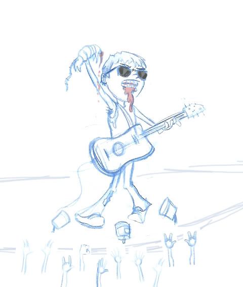
In the meantime I did some drawing...there's a lot of sitting around, so I was able to get to the sketches for a project I was just commissioned for. Character design roughs for a pitch. It doesn't have to be a fully realized character, but just the mood and tone for what they want. This is the first sketch:
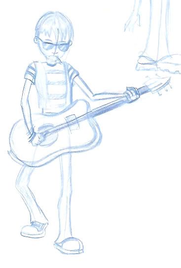

Now - it's not bad, but it's also just the first try. And, mind you, I don't draw people too often...much less adult people. I then had to keep trying, especially since I was drawing in my sketchbook amongst all these really good children's book illustrators (or at least people, like me, making the attempt). So I went on with this one. It has more of a story and kind of a cool idea that just hit me while I was zoning out during one of the breaks (not during one of the talks, because I pay close attention).
Labels:
scbwi
Monday, November 02, 2009
Microstock report for October 2009
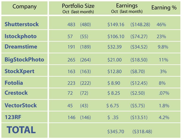
This is the microstock report for October of 2009.
This month was quite nice...as once again I didn't have much time for microstock, but yet we still did quite well. The total for all of our companies was $345.70.
Shutterstock once again leads the list. We made just under a dollar more than last month, and only uploaded 3 files (none of which were downloaded). What's nice is that we have had 7 people sign up as our referral, but this month was the first time that one of those referrals was accepted and started making money on Shutterstock.
Second on the list was Istockphoto once again. It's been a pretty good second place...and the only reason it's not doing better is that we don't have more files uploaded. This month was the first time on Istockphoto that we got an EL (an extended license) which is a $28 download.
The rest of the sites weren't terribly good or bad. Fotolia continues to disappoint from where it was when we started uploading...it used to be our third best earner and now it's falling below both Stockxpert and BigStockphoto. The biggest disappointment this month was 123rf. We had 13 dollars last month and then only a single subscription download this month...that resulted in only 35 cents...just terrible. I'm hoping it turns around this next month...but we'll see...maybe the 13 dollars was an anomaly...?
All in all it's been pretty good. The top three sites (Shutterstock, Istockphoto, and Dreamstime) are pretty consistant...and while it's hit or miss for the rest of the sites, they all continue to make money and it's been in the $300 range for the last few months...which isn't bad because my regular job at Nickelodeon has kept me from really focusing on any stock images...so it's nice to still be making money without spending any time on them whatsoever...
Labels:
dreamstime,
istockphoto,
shutterstock
Subscribe to:
Comments (Atom)
