Are you a Godzilla fan? I used to love Godzilla...I watched every single Godzilla movie I could. When I was a wee snot my mom used to take us kids to a theater on the weekend that played nothing but Japanese monster films. I just knew that this legendary japanese monster could crush our american King Kong (who was just a big mangy monkey anyway) without so much as trying...
But then they did this...
Did anyone else see Godzilla 1985? It was SO stupid how they lure Godzilla into a volcano with a tape recording of bird calls. Why would Godzilla do that? It didn't make any sense. It was based on the premise that dinosaurs were more bird than lizard...but does it make sense that Godzilla would hear a bird (ANY BIRD!???) and go running off after it...even blindly running to his death into a volcano? It was difficult for my small 9 year old brain to resolve how my favorite japanese monster could fall for such a horrible conceived plan.
And then came 1998. Roland Emmerich was going to direct a big budget feature length EVENT movie about Godzilla. I was terribly excited for this one. I went on opening night - and it broke my heart. Godzilla is a girl. Trying to give birth. And must do it in a basketball stadium because it looks like a nest (what's with the bird thing anyway? Why can't Godzilla be a lizard?!?) And on top of that we spend half the movie not being able to see the Godzilla clearly (he, I mean, she keeps ducking around the corner of the fakest set of new york)...and then when we do finally get to see our favorite monster - they've gone and messed with the design. And not just changed it, but ruined it. Godzilla looks stupid. And then suddenly the movie turns into a lame jurassic park where all these little godzilla spawns are running around the basketball stadium doing a weak raptor impression.
I just can't wrap my tiny bird brain around it...
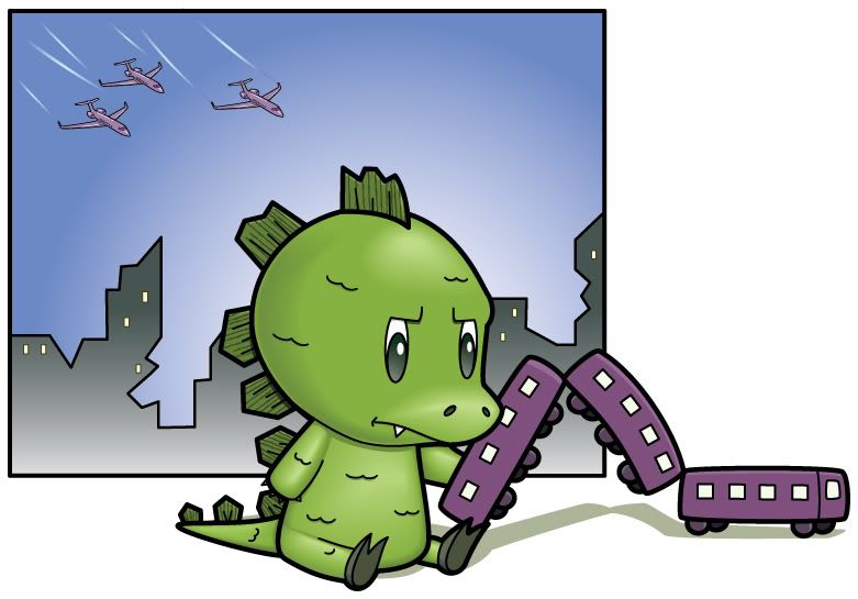
Anyway - I did this illustration last year as a photoshop painting. But, since I've been submitting illustrations to Shutterstock (a stock photography/illustration site)
I've been trying to create all my images in Adobe Illustrator. Since I did the lines in Illustrator, I was already half way done with this image. I just had to add shapes behind the lines (in Illustrator you do everything on layers and each color is a different seperate shape) and color them. Then I went about the horribly intricate job of creating blends (to add gradients to the image) that wouldn't read weird or mess up when converted to illustrator 8 eps files (which is the microstock standard for vector files). Now, I could have just turned in the photoshop version...but I thought I could do a better job in Illustrator (now that I know how to blend color) and vector images sell better on Shutterstock. I also thought the original colors were a little muddy and dark...so I lightened them up and made the overall drawing brighter and more friendly (such as the train, which was originally grey, is now a kid friendly reddish purple)...
And - as always - click here if you want to join Shutterstock!
- you can start uploading images (once your first, at least, 7 out of 10 are approved) and making money. The pay per download is small, but the amount of downloads more than makes up for this...and shutterstock is one of (if not) the best microstock agency out there on the web.
Wednesday, March 11, 2009
Subscribe to:
Post Comments (Atom)

5 comments:
Like the way it came out with the vectors, the lines and the gradient. Nice job!
Great job! I love the playful design. I also enjoyed reading your blog and I completely agree about those films! Well illustrated and well said!
He's so cute! Rawr!
awesome art work and post! totally agree with ya!
More of just a dinosaur fan. :-)
Post a Comment