Tuesday, March 31, 2009

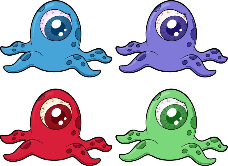
IF: Poise - Monsters! Or Aliens...! Or whatever...

If you watch monster movies...or Alien movies...or movies with evil creatures - you note that the people who survive exude a certain high level of poise and confidence. Those that run around screaming are usually eaten first.

I did these a little while ago - but wanted to redo them for shutterstock.

Photobucket


I don't think alien monster creatures will sell well - but I really liked these images. Originally I did them at the beginning of the year (or was it last year...?) as a possible vinyl toy design. I was really excited about designing vinyl toys - but that kind of petered out because of not knowing any companies to make these for me, and (when I thought about doing it myself) it was a bit on the pricey side for such speculation.

Photobucket

Next thing I know Dreamworks comes out with a movie (Aliens vs. Monsters) with a very similar blob monster. It even has one eye. I'm not crying fowl - because they've had the cartoon in production for a few years...but now my 'original idea' doesn't feel too original...

In any case - I did several colors of these creatures - just for variety sake. On Shutterstock, if you present options, you stand a better chance of getting some downloads. And, if you want - check out shutterstock - the approval process kind of turns people off (because you have to get at least 7 out of your first 10 images accepted), but it also helps weed out the suck and those not taking it terribly seriously. Not that there aren't still a lot of hacks on Shutterstock, and if you're one of these types, there's always room for one more. You'll still make money, you'll just be cashing in your soul...

Submit Photos to Shutterstock and make $$$!
Monday, March 30, 2009

IF: Poise - Water

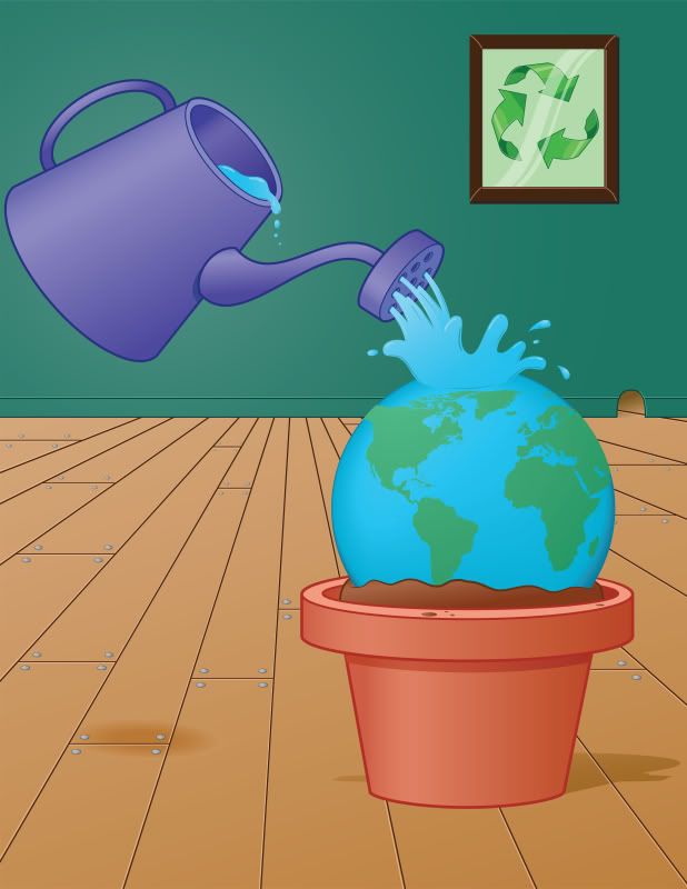
So over on Dreamstime they do a contest for stock art (mostly photographers, but illustrators can join too)...and those images get more views than my entire portfolio combined...I know, because I did it last month with another image. This time i created a brand new image (instead of repurposing a recent children's book illustration).

Photobucket

the basic premise is taking care of the earth with poise and dignity. Or something like that. You kind of have to talk it up so people will buy your concept...

Friday, March 27, 2009

IF: Poise - tight rope walker...

Photobucket

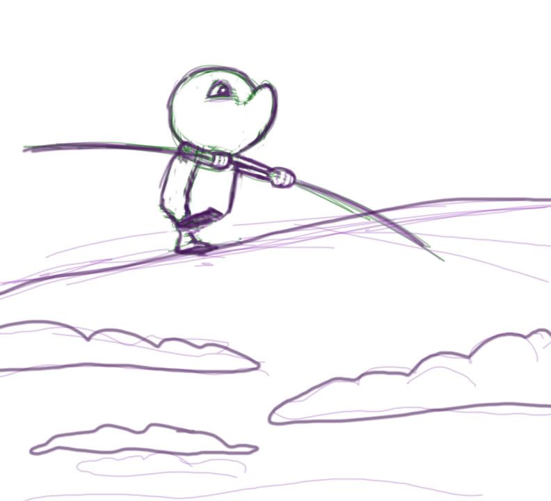
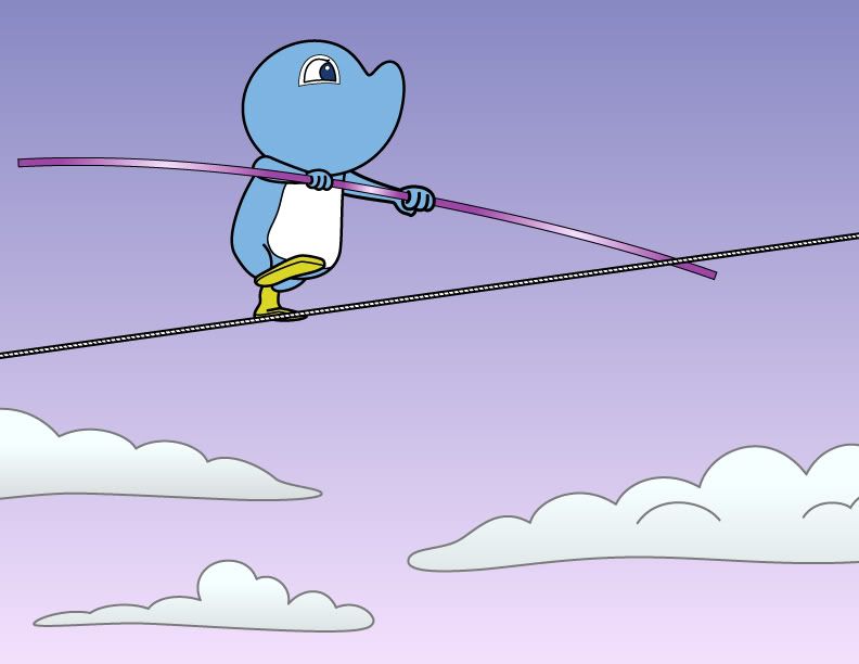
When I saw that this week's subject was Poise - my very first thought was the poise a tight rope walker goes through. There's currently a documentary about a guy, back in the 70s, who tight rope walked across the twin towers. Could you imagine being that high...in New York...with all that wind and height...it would take a lot of concentration and poise to make it across. Anyway - that doc is in my netflix que and this drawing is on my docket to be worked on.

I did that original sketch in photoshop - it's very rough because I used a wacom to draw (it's much easier on a cintiq)...then I copied and pasted it into illustrator and did a quick cleanup of it - I'm going to print it out and revise it and rework it a little bit...but I like how it turned out...

Photobucket

It's not finished yet - but it's a start.

Monday, March 23, 2009

IF: Subtract

So you might have seen this picture before:

Photobucket

I've been posting quite a lot lately about how I'm uploading to a lot of microstock companies (such as Shutterstock)...on a site called Dreamstime they hold contests every month. The prize is almost inconsequential because a photograph will always win it - so sucks to be an illustrator on that site - but your image immediately gets bumped up to the top tier of image price (whereas you would usually have to sell about a hundred copies of it to get there)...and your image gets a lot of attention (it's my second highest viewed illustration on that site)...

Photobucket

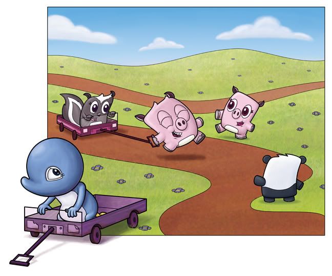
The contest subject was "Play" for the month. I didn't really want to create a new image, but I was thinking of putting this on my microstock accounts anyway...I really like these little 'pillow' looking creatures, but I still don't know what to do with them - I don't have a children's book story with them in mind, and while I want to draw more of them, they don't have a marketable home. So I thought I'd put them up for the contest (you have to give dreamstime exclusive use of the image for a full year). However, I didn't want to tie up Adelia into something...especially didn't want to sell her image for so cheap - so I had to subtract her from the image and recreate it without her.

It's easy enough in photoshop - I still have my original vector lines attached to the psd file, so I just deleted Adelia's color, and then her lines and used the stamp tool to recolor in all the parts that she was originally in.

I didn't win the contest...but I thought this was a good introduction to that site - and I'm going to continue to compete - but I'll start submitting new images...and probably vector stuff...

Monday, March 16, 2009

IF: Legendary

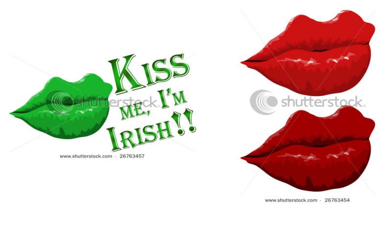
So I was on a hike with a couple of friends yesterday and we got to talking about shutterstock - because that's all I talk about these days. But while talking the subject turned to what to put up. I told him that he had a bunch of photographs of lips - but the photos he took were of a really cool nature (I won't give away his technique) - but that got lips in my head. And with St. Patrick's Day just a little ways away (tuesday, I think) I had 'kiss me, I'm irish' that had to be expressed.

Now when you do the 'kiss me, i'm irish' nonsense, it usually is accompanied by lips - so I wanted to do a set of big luscious lips. Because what else says that you need kissing other than big ol' pucker lips. And when you think about big ol' lips, you're probably thinking of Angelina Jolie - she of the legendarily large lips. With that in mind, I drew these lips in Illustrator (using the pencil tool...that way I could have some very irregular lines...and could get to it easily).

What I have here are two pictures that I uploaded this morning to Shutterstock, and they've already been approved...so I just have to wait until they get put in the system and we'll see if there's any downloading...

Photobucket

Anyhow - Shutterstock is terrific for making extra cash with your illustrations (or photos, if you're one of those jerks)...
Click here to start your own magical journey with Shutterstock
...or don't...if you don't like having fun...

Wednesday, March 11, 2009

IF: legendary

Are you a Godzilla fan? I used to love Godzilla...I watched every single Godzilla movie I could. When I was a wee snot my mom used to take us kids to a theater on the weekend that played nothing but Japanese monster films. I just knew that this legendary japanese monster could crush our american King Kong (who was just a big mangy monkey anyway) without so much as trying...

But then they did this...

Did anyone else see Godzilla 1985? It was SO stupid how they lure Godzilla into a volcano with a tape recording of bird calls. Why would Godzilla do that? It didn't make any sense. It was based on the premise that dinosaurs were more bird than lizard...but does it make sense that Godzilla would hear a bird (ANY BIRD!???) and go running off after it...even blindly running to his death into a volcano? It was difficult for my small 9 year old brain to resolve how my favorite japanese monster could fall for such a horrible conceived plan.

And then came 1998. Roland Emmerich was going to direct a big budget feature length EVENT movie about Godzilla. I was terribly excited for this one. I went on opening night - and it broke my heart. Godzilla is a girl. Trying to give birth. And must do it in a basketball stadium because it looks like a nest (what's with the bird thing anyway? Why can't Godzilla be a lizard?!?) And on top of that we spend half the movie not being able to see the Godzilla clearly (he, I mean, she keeps ducking around the corner of the fakest set of new york)...and then when we do finally get to see our favorite monster - they've gone and messed with the design. And not just changed it, but ruined it. Godzilla looks stupid. And then suddenly the movie turns into a lame jurassic park where all these little godzilla spawns are running around the basketball stadium doing a weak raptor impression.

I just can't wrap my tiny bird brain around it...

Photobucket


Anyway - I did this illustration last year as a photoshop painting. But, since I've been submitting illustrations to Shutterstock (a stock photography/illustration site)
I've been trying to create all my images in Adobe Illustrator. Since I did the lines in Illustrator, I was already half way done with this image. I just had to add shapes behind the lines (in Illustrator you do everything on layers and each color is a different seperate shape) and color them. Then I went about the horribly intricate job of creating blends (to add gradients to the image) that wouldn't read weird or mess up when converted to illustrator 8 eps files (which is the microstock standard for vector files). Now, I could have just turned in the photoshop version...but I thought I could do a better job in Illustrator (now that I know how to blend color) and vector images sell better on Shutterstock. I also thought the original colors were a little muddy and dark...so I lightened them up and made the overall drawing brighter and more friendly (such as the train, which was originally grey, is now a kid friendly reddish purple)...

And - as always - click here if you want to join Shutterstock!
- you can start uploading images (once your first, at least, 7 out of 10 are approved) and making money. The pay per download is small, but the amount of downloads more than makes up for this...and shutterstock is one of (if not) the best microstock agency out there on the web.

Sunday, March 08, 2009

IF: Intricate

I went through the images I've done for Shutterstock - and I don't really have the most complicated (intricate) images. I believe they're well done (as they do need to appeal to someone for them to want to download my illustrations)...but they don't have to be intricate...I have done a couple that have been a bit more work than others -
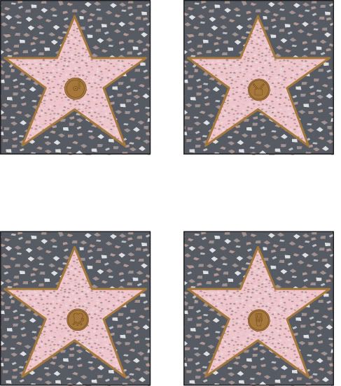
Photobucket
These might not be a lot to look at - but it was tough trying to get a texture that would match the street of hollywood and work well in an illustration. At the same time the color of the star and the edges had to match real life (or at least simulate it well enough) AND I had to look up all the icons for each of the different things that people were being celebrated for - movies, radio, tv, and music. Anyway - after all of that - I turned it in and was rejected.
Turns out the Hollywood sign and the walk of fame are trademarked. So you need their permission, even if you're going to do a drawing based on this subject. Very sad.
But I have other stuff - and better stuff up on the Shutterstock. And that stuff is doing just fine. What's making some of my newer vector stuff pop is the inclusion of blends in Adobe Illustrator. I've been using the program for more than 8 years and I'm still learning. Basically blends are an easier (and more intricate) way to do gradients...and easily! It's made me want to draw all sorts of things -

Photobucket
such as flowers (!) that I never would have thought of in the first place - and only because I could finally do a nice looking gradient in Illustrator (which, in the olden days, you'd have to build shape on top of shape and repeat forEVER before you got anything that looked that good)...


Submit Photos or illustrations (especially vectors) to Shutterstock and make $$$!

Thursday, March 05, 2009

IF: Breezy #2

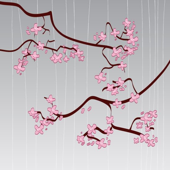
So this is my latest in the Cherry Blossom series - Photobucket

I've been trying to expand my abstract background portfolio for shutterstock (it's a stock illustration/photography site where you upload your artwork, or photos, and the more downloads you get, the more money you make) -
Click here if you want to start up your own shutterstock account...


I quite liked this one - it's very light and soft - which is very different from the other ones I've done.

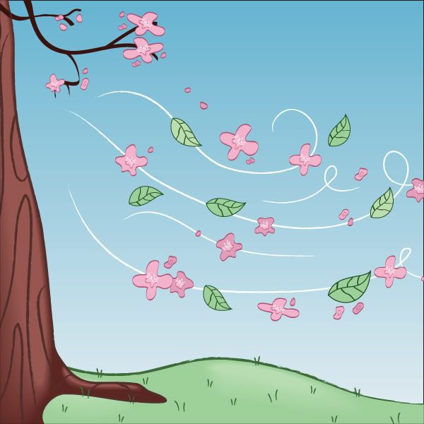
Obviously this fits in with Illustration Friday with the leaves/petals having been blown to the floor.

Wednesday, March 04, 2009

IF: Breezy

So I'm currently obsessed with doing images for Shutterstock (a microstock illustration and photography site). Basically, you upload your illustrations and people pay to use them. So far it's worked quite well - but since I've been doing that, it's been hard to come up with a concept that has to really do with Illustration Friday. So I thought I'd have my cake and eat it too.

Most recently I've been drawing cherry blossoms.

Photobucket

Photobucket

And I thought I'd try and do something that was cherry blossoms, but would also work for Illustration Friday. Breezy is a horrible word - I couldn't think of anything other than the obvious...but I thought this was a nice, fun, cartoony cherry blossom illustration with flowers blowing in the breeze...

Photobucket


Click on this link to start your own Shutterstock profile.

Monday, March 02, 2009

Microstock - photo and illustration stock websites

So I've been on several 'microstock' sites for the last month.  They've been hit or miss on a couple of sites - but it's been paying off quite well on one.

Shutterstock seems to make the most money - especially for vector art

I know a couple of photographers that are on the site - and they'd back me up on that - it's not just that the clients seem to like vector art more, but that it's easier to get images approved on shutterstock if they're art, than photographs. There's so much stuff you have to watch for in a photograph (such as pixelation, blur, or noise) - but I've hardly had any problems with my illustrations. The biggest problem is that if you work in vector art (Adobe Illustrator) then you have to back save everything as an Illustrator 8 eps. That's no problem, except if you're using filters or effects or things that weren't compatible with version 8. But since I found that out - I usually just avoid those things (like gradient mesh and I don't go too crazy with transparencies).

Anyhow - here's a breakdown...as far as it's worked for me:


Shutterstock - 95 % of microstock earnings have come from Shutterstock

Dreamstime - 3 % - this is a hard one to judge though - they take a little bit more time to accept any images (shutterstock approves images in about 2 days, if not sooner - whereas Dreamstime takes about a week AND then another day or so to upload into the search engines...so while the images might have been created at the same time, they're still finding their feet on Dreamstime) - if you wanna check out this site - http://www.dreamstime.com/res1220499-dreamstime - that's my referral number...


Stockxpert - 2 % - I'm not a fan of this site - they take too much time to upload.  They make you upload a high quality jpg version as well as an eps file - but it can't just be an eps file, it has to be zipped.  And they're the most strict with open paths and color profile conflicts and bitmaps (meaning, that if you have any of these then your image will be denied).  They approve (and deny) the quickest out of all the sites, but they are the hardest to get approved by (as the smallest thing will get your image turned down).

Fotolia - .05 % - that's right - POINT OH FIVE!  it's been quite a small part of my stock images - but it's the easiest to upload images to - what sucks is that they want all their vector files as SVG (which is a suck version of AI or EPS files)...they've also been slow - but I feel like it' s a matter of time.  The month of March is turning out quite a bit better as I've already made $2.50 (as opposed to February's 2 downloads and 60 cents).  What's nice about Fotolia is that you can see how many people have viewed your work (I'm averaging about 60 views a day, so I feel like it's only a matter of time before people start downloading my stuff).

Fotolia

Anyhow - so that's the month of February for Microstock.  It's been a lot of fun - and especially because Shutterstock has been so successful so far.  We started with a base of 40 images (and by we, I mean my wife and I...as we're both creating images) and have created about 160 new illustrations for these microstock sites since the 6th of February.  So, I expect our totals to go up as we build our portfolio...so far, so good!

IF: Breezy - abstract backgrounds

The best abstract backgrounds I've seen, and I'm biased - are the ones my wife created for shutterstock

Photobucket
abstract blue swirl


abstract rainbow background

 For anyone wanting to purchase either of these files for use - go ahead and visit shutterstock.  Just search under my name isaac marzioli.  That way you'll be able to get these files at a hi res quality (instead of the small 72 dpi that they are here).


Submit your vectors to Shutterstock and make some money!
It's quite easy - especially if you work in vector art (that's Illustrator or, if you're lame, some other vector program like Coral draw or something)...shutterstock clients LOVE vector art!
 
Free Hit Counter