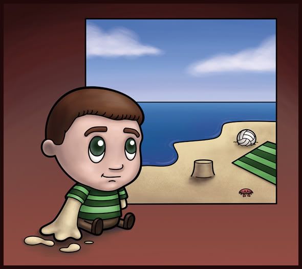
I would assume this is the most popular version of the Sandman. While the Sandman from DC/Vertigo Comics is quite the cult fave, Spiderman's long time nemesis stands out as the most iconic. The Marvel Comics Sandman was invented in the 60s to menace Spiderman (and in classic Stan Lee fashion, each hero or villain's name described their ability).
Originally I was just going to draw this version of the Sandman. I went online because I wanted to be sure about his costume - for some reason, a green striped shirt...he also had striped hair (but I don't understand why...so I didn't draw my version that way). While online I discovered the other two versions of the Sandman, so I had to draw all three. They all come from different times in the comic book history and all represent a different interpretation of what a character called Sandman would be.
And now on to other characters...I think my couple will be Pinocchio and Peter Pan. Hopefully I'll have those out this next week some time...
Thursday, October 30, 2008
Wednesday, October 29, 2008
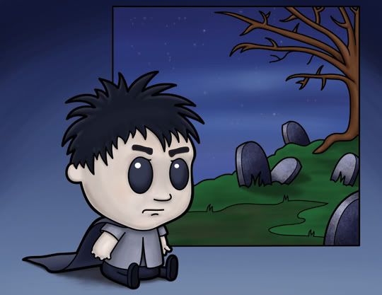
The Sandman: from DC's Vertigo
Now, I'm pretty sure this guy's name isn't The Sandman - so maybe I should have named it differently...maybe he doesn't even deserve to be involved in the Sandman group...his name, I believe, is Morpheus. But he's the main character in a comic called The Sandman - so that counts. Close enough, anyway.
This one is a little bit different than the other ones, because I've decided to develop the hands a little bit more. Previously I left the fingers off completely (or, in the case of the godzilla, I drew little stubby claws), but I feel like the line of characters is evolving. Who knows, maybe one of them will stand up soon...but probably not - I did these drawings specifically with them in a sitting pose because I wanted it to look like a doll or stuffed toy that's propped up. I wanted it to have life and dimension, but the also needed to have that stillness and familiarity that would lead to the view to see them as incredibly cute.
All that's left is the Sandman from the spiderman comics...
Monday, October 27, 2008
The Sandman: one version
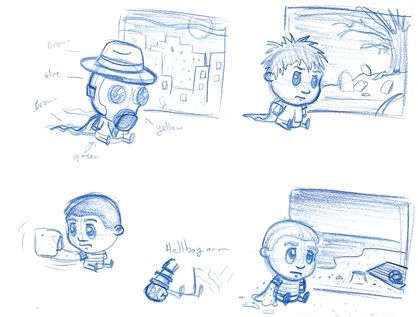
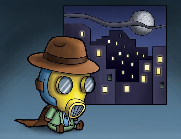
So I was all set to do a version of The Sandman (from the spiderman comics)...I had the drawing all finished and went onto google to make sure I had the correct colors - I typed in Sandman and three different comic versions came up. They weren't 3 different versions of the same Sandman, they were three different characters throughout comic history with this name. One of the ones that struck me the most was this guy dressed in a green suit with a gas mask on. I thought it would be fun to do a version of all three of the characters, and the gas mask guy was the first.
In the upper left hand corner is the first comic character named The Sandman. He's pretty much a knock off of the Green Hornet, with the green suit, 'mad men' hat, mask (although his is a gas mask) and gas-gun. It's the 'golden age' Sandman.
The upper right hand corner is the DC comics version of The Sandman. He was created by Neil Gaiman (and while the comic is named "the Sandman," the main character, which I've drawn above, probably isn't named Sandman. From doing very little research, I believe his name is Morpheus and he's the comic's main character. The comic is called The Sandman because the main character is the anthropomorphic personification of dreams.
And finally - the bottom two drawings are the Marvel Comics version of The Sandman. And, in typical Marvel fashion he's quite literally a man made from sand. I did two versions of him trying to figure out if I wanted to draw him with a fist, or just a loose arm of sand...
Anyhow - the first one I finished is the Golden Age Sandman.
Friday, October 24, 2008
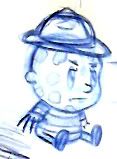
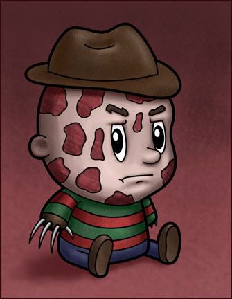
Freddy the kid: Freddy Krueger
I've always wanted to go as Freddy Krueger for Halloween. I never did, but one year I bought the glove. 10 bucks. I thought it was pretty bad ass.
Anyhow - I'm in the middle of doing a series of entertainment icons...and since halloween is coming up, I've been concentrating on horror movie icons. One of my favorite villains has to be Freddy Krueger. My dad had my brother and I watch the first Nightmare on Elm Street when we were kids and we spent that night huddled in our beds, scared out of our minds...I remember looking at the door to our room, expecting some form of monster to come tearing through at any minute.
As I grew up - the picture that haunted me the most was of the girl in the body bag walking up the steps (from a basement? I can't remember)...and a creepy scene where Freddy is walking down a alley way scraping his arms against each wall. I saw that scene recently and couldn't believe it used to scare me. His arms grow long to reach each side of the walls, but it comes across as so cartoony. Maybe it's still scary, I'm just watched too many horror movies...
Thursday, October 23, 2008
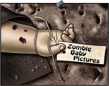
Illustration Friday: Late
I did this painting a little while ago...it's called Zombie Baby Pictures...because it was suppose to be the first in a series of pictures staring zombie babies...I've got a bunch more that I've drawn thumbnail versions...but even whenever it is that I get to those, they won't be on this level...I'm currently working in a very painterly cartoon style...whereas when I did this picture I wanted it to be incredibly realistic (as far as I could draw) but still have lines...so it would have a strange hyper realism to it. And as we all know, Zombies are dead, making this quite a late baby (which is how it ties into Illustration Friday)
I'm also quite proud of the pushpin sticking in the picture - that turned out quite well...
Labels:
Illustration Friday,
Late,
Photoshop,
zombie baby pictures
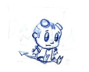
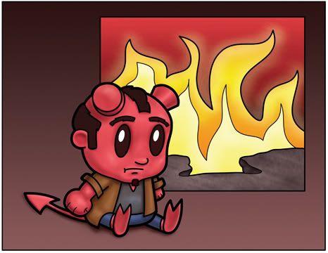
Hellkid
It's been pretty hard finding time to do these...but I'm still trying to fit them in. I've been quite busy at work, and have been finishing up some freelance at the same time. Since it's almost halloween, I've been trying to get all the halloween related illustrations up. I've been working on a headless horseman, but the bridge behind him hasn't really been working out so well...so I decided to take a break from that and work on my kid version of Hellboy. Why do they call him Hellboy, if he's a man? It makes it hard to name a boy version...so I've changed the name to hellkid.
In the original drawing I didn't do Hellboy's big hand, so I modified that in the cleanup...to reflect a first befitting Hellboy.
Sunday, October 12, 2008
Friday, October 10, 2008
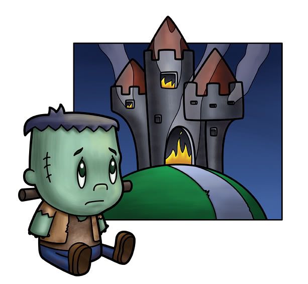
Frankenstein: my version
When I was growing up, I always thought that Frankenstein was the monster's name. Eventually I came to the realization - mostly because I kept hearing Frankenstein's monster - that it was just an unnamed monster and Frankenstein was the fella that created him. Well, all that was when I was a kid.
A couple of years ago - I finally bought the Berni Wrightson illustrated version of Mary Shelley's Frankenstein. I had no idea how long and ridiculous the story actually was (being more used to the monster movie of the 30s as well as Young Frankenstein). I did see the movie version that Kenneth Branagh did with Robert De Niro, of all people, playing the monster. It (like the book) went against everything the other movies made iconic. The monster could not only talk, but converse in intelligent conversation. Well - the book faired better than that movie - Branagh's heavy handed directing (the swooping camera...twirling around the director, who also starred as Frankenstein) as well as all the overacting ruined what could have been a spectacular movie (it did try to follow the book's storyline better than the old 30's movie).
Anyhow - I prefer the iconic 30's Frankenstein. This is my version of that iconic monster.
Labels:
cartoon,
Frankenstein,
Frankenstein's monster,
holloween,
Photoshop
Thursday, October 09, 2008
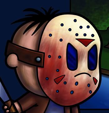
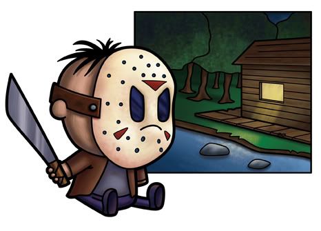
lil' Jason
The latest in my line of media icons comes from Friday the 13th. I did several drawings of movie villians and this one was the strongest. I'll have more in the coming weeks - but I believe this one will be my favorite. I had a lot of fun drawing Jason in this style, and a tough time texturing the color...but I think the struggle made it all the better. And it ended up being quite a strong painting.
I did two different versions of his mask - one with a lot of red...sort of a gory version and a 'clean' verson.
Anyhow - I love this series of illustrations. I want to do something with them...
Labels:
Friday the 13th,
Jason,
lil,
Photoshop
Tuesday, October 07, 2008
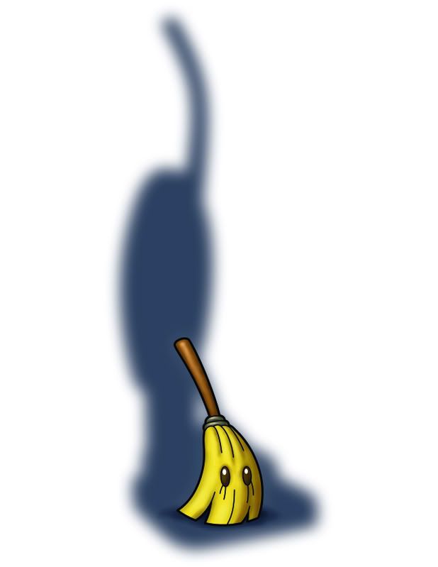
The Broom
I was hoping The Angels would be swept out of the playoffs by Boston - I had to settle for them losing in 4. So it'll be a little bit harder to shame the Angels fans, but I can still make fun of them for losing in the first round (much like the A's did all those years). Anyhow - with the sweep in mind I created this character in my new line of drawings...
Labels:
angels,
baseball,
Broom,
children's Book,
cute,
hello kitty,
Photoshop,
tokidoki
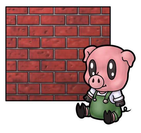
The Three Little Pigs
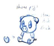
I've been working on these for the last few days. I said in a previous post that I had a ton of drawings in a similar fashion - and these are what I've just finished. I want to draw more - I want to keep expanding this line of drawing, and possibly market them...I thought these would lend themselves to a series - as The Three Little Pigs would not only fit into my series of cute characters, but also become a series all to themselves. I did two different versions of them. Originally I wanted them to be completely the same - in the same way that the original Teenage Mutant Ninja Turtles were indistinguishable - but what let you know which pig was which was the square behind them:
I started off with the pig shape - wanting just a really cute pig - I figured that once I got into Adobe Illustrator, I could draw in a background behind him. After I finished with the drawing I realized that it'd work better to have more of a hoof on the pig rather than little generic feet (which work with most other characters). So I drew it in next to it (because I could always clean it up and attach it in Illustrator at a later time). Anyhow - I cleaned up the pig, added a square behind him and then copied him two more times. And I had my 3 pigs. I just had to put their signature building items behind them and I was ready to color.
I had finished drawing the three pigs when it occured to me that it'd be fun to do a nude and clothed version. It meant a little more time (but just a little - as I could reuse the pig color and the background color). I like the clothed version better - each one ends up with more of a personality. You'd be able to get more of an idea why each pig would build his house in his particular way.
I still don't know exactly what I'll end up doing with this series of drawings. I'm going to work on getting something licensed - and the more drawings I have, the better chance I'll have towards achieving that goal. In the meantime, these and what else follows can end up in my tiny gallery show in the Nickelodeon hallways this summer. Maybe, just maybe, I'll get enough good stuff going that I'll want to do a real gallery show later down the road. But we'll see...
Labels:
cartoon,
children's Book,
cute,
fable,
Illustration,
Photoshop,
sketch,
story,
Three Little Pigs
Monday, October 06, 2008
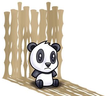
Panda Menace
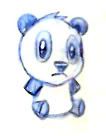
Last weekend I did some freelance work for a handbag designer named Nikki Chu. She wanted something that was similar to Hello Kitty or Gwen Stephani's line Hirojuku girls or Tokidoki. So I had a lot of information to grasp, in order to do something in a similar style. What came out of it were some really cute drawings and a few really nice props that I designed in Illustrator.
Anyhow - I ended up really liking they style of Tokidoki - it envokes the cute simplicity of a particular Japanese art. Based on the previous drawings I did and the research - coupled with the cute head shape I've been drawing for a children's board game - I decided to do a series of drawings...again, drawing from all of these other things, but doing it in my own style.
I currently have 4 or so pages full of little characters like this. I'm going to have a lot of work ahead of me to get these things cleaned up and colored. But it was a lot of fun, and I love how the color version turned out. As usual - I cleaned up the character in Illustrator, and did a 'shadow' of bamboo in the background (also in Illustrator). When I colored it in photoshop I erased the lines of the bamboo to give them a softer look.
Anyhow - as always, I'm available for freelance illustration work. If you need to take a look at more samples, check out www.isaacmarzioli.com.
Labels:
animal,
children's Book,
cute,
Illustration,
illustrator,
manga,
panda,
tokidoki
Adelia: Menacing Shadow
I haven’t forgotten about Adelia...
I've just been really busy. I've been meaning to submit my Adelia children's book story, but still haven't. I go back to work in about a week or so - which means I have just about that amount of time to get it done.
In the meantime - I've been working on a lot of freelance projects to fill up all that time I could be slobbing in front of the tv playing a video game.
At the beginning of my haitus I did a couple of watercolor paintings, but haven't had a chance to do much since.
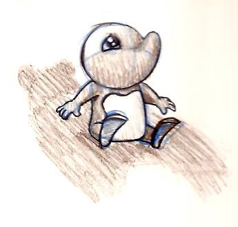
Currently - when I'm not doing freelance work - I'm looking towards the future - getting into licensing. I want to license my characters or prints or posters or something based on something I've drawn. The best bet, so far, would be Adelia. I did this drawing while working on my current freelance (the children's game, whose details I'm not allowed to discuss until after it's printed)...
The scan made it come out all yellow and brown - but it's just blue pencil cleaned up with a regular HB pencil. I thought it was an original idea, but it turns out I am just copying an idea Tracey had for a painting she drew about two weeks ago. In any case, I don't think I'd be able to market this picture any - but I like just being able to draw Adelia. I cleaned it up in Illustrator and then colored it:
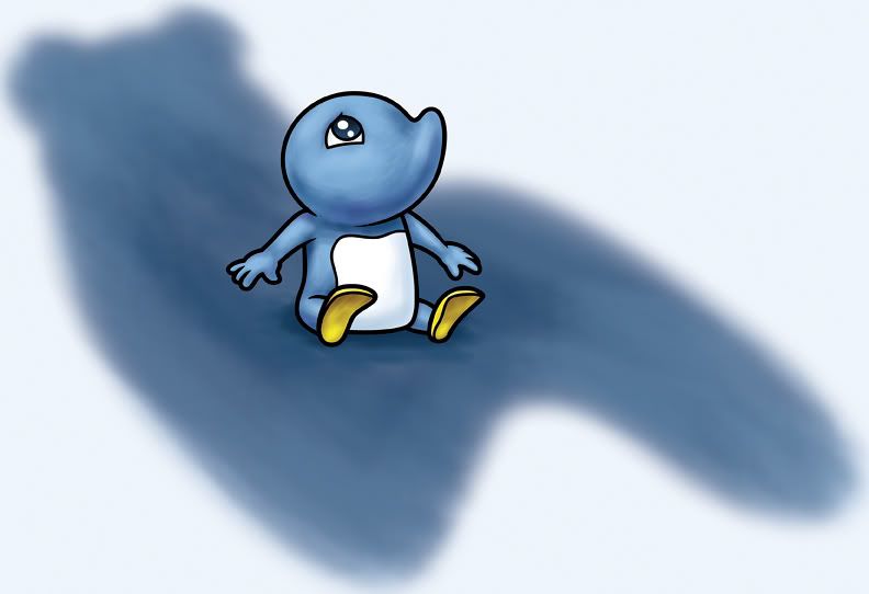
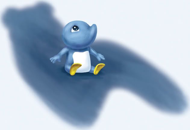
It's a different coloring style than I usually go with for Adelia - but one I'm trying to practice for any and all other paintings I do in Photoshop. I hate that photoshop looking painting where it looks like it was painted in photoshop. Everything comes out all rubbery and fake. I still have tendencies in that direction (as I don't paint in photoshop as often as I'd like), but I'm working on improving. I love the way brushstrokes look, and I'm trying to move in that direction. I also repainted (touched up mostly) Adelia without any lines, just to see what that would look like. I think the colors need to have more contrast, but it looks pretty cool without any lines at all...
Labels:
Adelia,
cartoon,
cartoons,
children's Book,
Drawing,
Illustration,
illustrations,
illustrator,
Photoshop
Subscribe to:
Posts (Atom)