Thursday, December 31, 2009
Microstock Report for December - and year end totals.
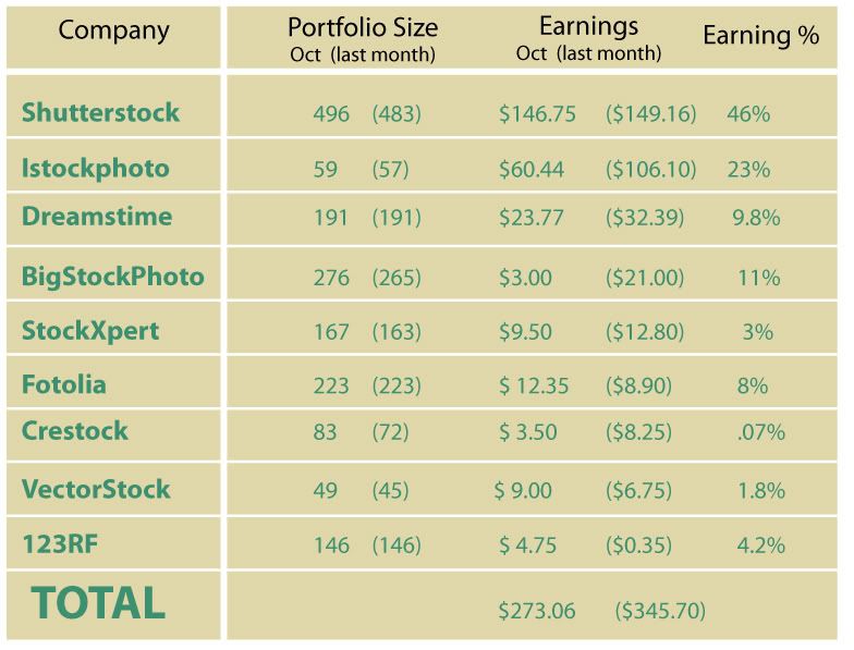
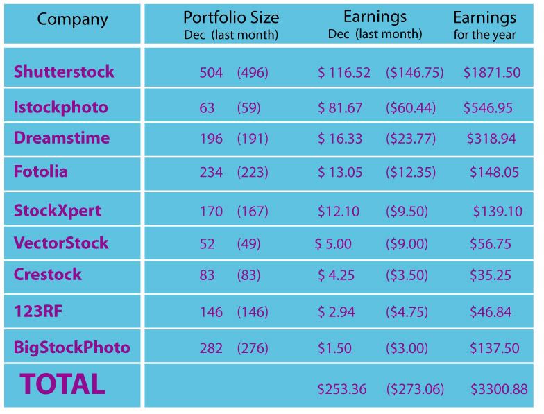
This is the year end report for my first year of selling stock illustrations. I was surprised at how much I ended up making. You can see the total for yourself, but it came out well above $3000 between all the sites. Some were successful and others were very disappointing, but all of them contributed towards quite a happy year in microstock.
The top moneymaker and overall good stock site was, once again, Shutterstock. This month was quite a low one - as all across the board (with the exception of Istockphoto) the stock sites stalled out because of the many holidays...but Shutterstock was the clear winner for the year. It was the first site I signed up to and the best overall - I had a steady stream of downloads every day (which prompted me to check it several times a day) and even a large chunk of 'on demand' downloads (which are almost $3 apiece). And, what was quite a happy day this last month, I finally had a referral that actually uploaded images. So far I have a list of about 10 people and it wasn't until last month that one of them actually made it through the approval process and uploaded images.
What's nice about a referral is that they get to live their own separate microstock life, but every download they get, you'll get three cents. I ended up making over 16 dollars from such downloads. I'm also glad that the website that I stumbled upon that gave me the final push to get into microstock is getting 3 cents for every one of my downloads (Thanks again Cory!).
Anyway - second on the list was Istockphoto - I started late with them...and almost gave up entirely. But I kept reading that this site was the hardest to get into and had the most complex uploading process...but that it ended up being worth it. And it's true. It's one of the leading sites for microstock - and even though you end up with less downloads per day, each one is worth more money. And even though this site didn't really get going until May (all my other sites were up and running by March), I still made about $550.
One site that was the biggest disappointment was BigStockPhoto. While they're one of the big 5 or so stock agencies...they have fallen hard. I made $3 last month and half that this month. I believe it to be the fact that Shutterstock purchased them, and people are waiting to see what happens from that...because it wasn't until that was announced that the downloads almost completely shutdown. But it's too bad because they have the easiest uploading process (the bit where you only have to upload your eps files and they'll generate their own jpg preview. All the other sites you have to create your own jpg preview and each site has their own size parameters). Oh - and one other disappointment, but I didn't expect much - there was this site called VectorNexus - I ran into them through a microstock message board. I uploaded a couple of images and had a couple of downloads...but their site is no longer on the web. I believe they went under...but since I only put four or five images on there in the first place, I didn't see it as that much a waste...although they never paid me out for those two downloads....
All in all - I'd say that microstock is quite a fun side project past time. It can be a greater money maker if you're willing to put the time into creating good images. Or it could be a steady stream of extra cash (as it is for me) where you only spend a couple of hours every month keeping things fresh by uploading a few new images.
Labels:
istockphoto,
shutterstock
Sunday, December 20, 2009
my new promotional postcard
Friday, December 18, 2009
IF: Undone
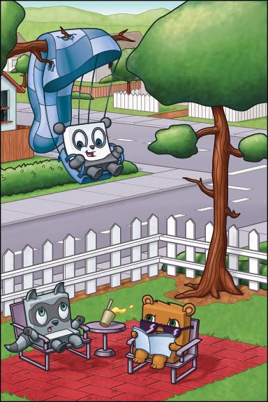
If you're hung up in a tree you wonder how you'll ever come undone...actually - the undone part isn't so bad, it's coming undone and unharmed - that's the real trick.
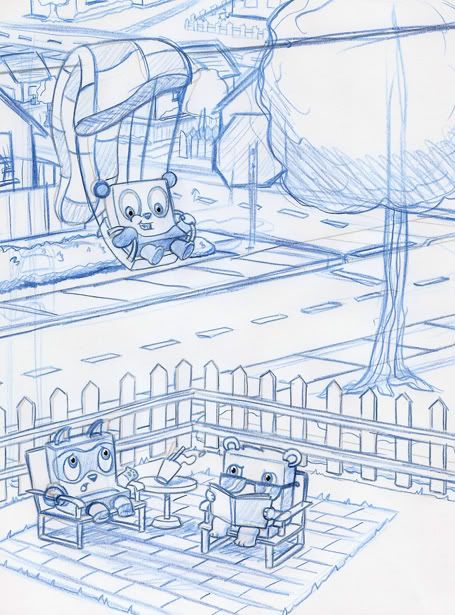
This illustration was a beast! I think I've been working on it for the last 3 weeks, at least...and I've been thinking about it for a little bit longer than that.
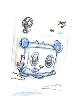
A few weeks ago I did a little doodle:
This illustration was a beast! I think I've been working on it for the last 3 weeks, at least...and I've been thinking about it for a little bit longer than that.
A few weeks ago I did a little doodle:
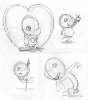
I did that as a doodle because I had to draw my characters after several failed attempts at a lawn gnome (those are terrible drawings and will never be posted). And this sketch turned out good enough that I thought I should finish it.
It ended up being quite a good illustration - or, at least, for me - it was good enough that I wanted to send it out as my next postcard to children's book publishers. But I now needed to tell the rest of the story. What could I put on the back of the postcard? The obvious choice to me was either to show them in the plane or landing. I thought landing would be more dynamic, so I set about thinking about what that would entail.
The drawing was supposed to be very simple, and the more I drew it the more complex it became. Suddenly (well...after 3 weeks of drawing and/or revising) I had this detailed (photoshop) illustration. I might cool down the red of the bricks, but I think it turned out pretty good. So good, in fact, that this is going to be the front of the postcard and the skydiving is the back...
Labels:
bear,
IF,
Illustration Friday,
panda,
raccoon
Monday, December 14, 2009
Sunday, December 13, 2009
Friday, December 11, 2009
IF: Hatched Skunk
I thought I'd try out a couple of other characters in eggs...since the topic on Illustration Friday is Hatched...
Labels:
IF,
Illustration Friday,
skunk
IF: Hatched Panda
This actually turned out better than I thought it was going to.
I was at the San Diego zoo about 5 or 6 years ago and found, in the gift shop, some really cute little glass statues of various animals hatching out of eggs. The cutest one was this little rhino. And what made it better was, at the time, a rhino had just given birth, so you could go to the exhibit and watch this cute little baby rhino running around and coming really close to the fence. So I had to buy the baby rhino in an egg statue.
Since then I've seen this trick a lot - a cute little animal or character will get even cute if you put it coming out of an egg. It probably trips some sort of sensor in our brains that makes us coo at babies (like when one of your friends has a kid and everyone comes over to hang out but ends up just standing around in a circle staring at a baby that's not doing anything...but nobody can look away).
Anyhow - I like these little characters I've drawn, and putting them in costumes or in cute situations seems like the next step...next think you know the panda will be wearing a frog or a pink bunny costume. Stay tuned!
Labels:
IF,
Illustration Friday,
panda
Tuesday, December 08, 2009
The Panda has landed - revised
This was originally going to be the back of the postcard (that I'll mail out to publishers and clients)...but now I'm thinking that it's better than the front of the postcard...
Sunday, December 06, 2009
Before you go crunch on the ground...
It's probably better to end up in a tree. Of course, I think in this story's case, the panda would have been fine wherever he landed...but he seems pretty thrilled that he ended up stuck above this nice couple in their backyard...
This is a much more involved illustration than some of the previous square animal but I want to show that I can draw scenes, and not just characters (as this is going to be sent with the other skydiving illustration to different children's book publishers).
This illustration still isn't done - I'm still debating on whether or not the panda should be on a telephone wire, or a tree limb...and there still needs to be a house or some sort of background nonsense...my first thought is to put a field back there, but that doesn't really show off too much skill...so I'll be adding a full background...
I did a quick color fill just to make it easier to see which direction the illustration is going. I am definitely leaning towards putting a tree there for the panda to be stuck in...
Labels:
panda
IF: Crunch...on the ground...!
So I'm working on a followup to the skydiving animals I did a couple of weeks ago. It's been really tough trying to figure out what the outcome to that illustration should be. It's taken me all this time and countless drawings trying to work it out.
I've finally decided on this:
It's, obviously still in rough form...but I'm going to clean it up today in Adobe Illustrator and then print it out and revise my lines in blue pencil (which is just how I always work...the above illustration was the original drawing scanned into the computer - you can sort of make out perspective lines trying to line things up and correct wonky directions...I've already printed it once and gone back over it with a blue pencil).
Originally I kept drawing the panda bent over a branch of a tree and the other skydiving characters around him...or slamming into the ground with a big crunch (which is probably too graphic for a children's book style illustration)...but the idea of the panda stuck on a telephone wire (that part isn't drawn yet) and surprising some folks who were just sitting in their backyard sounded like a better idea).
Hopefully I'll have this drawing done later today and it'll be ready for color.
Labels:
bear,
IF,
Illustration Friday,
panda,
raccoon
Friday, December 04, 2009
IF: Crunchy cereal!
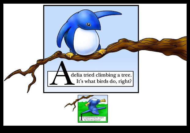
I had this old drawing from a children's book dummy that I was working on based on my character Adelia.
When I saw the topic of the week for Illustration Friday (Crunchy) I automatically thought of eating crunchy cereal...which is what Adelia is doing here:
I dusted off the old adobe illustrator drawing and painted it in photoshop this very morning. Sure I sort of cheated by having such a nondescript background, but it's only there to frame Adelia eating her deliciously boring looking cereal.
I was told by an executive at Nick Jr (Nickelodeon for smaller kids) that my character Adelia needed a mouth, so I've been toying with what she would look like with one...which is why, when I finished this illustration, I went back in and drew a mouth. I kind of think it's a stronger piece...it shows more that she's eating AND enjoying herself...
What's nice is that there's a website called Foodista - from what I can gather, it's a website that's all about food - and the link above is for cereal. They e-mailed me just this morning because they found my blog in a search and liked the above drawings. I thought that was nice enough that I'd post a link to their website (plus, they asked really nicely). But anyhow - if all that talk about cereal gets you craving some food - hop on over to foodista...and you just might find something tasty.
By the way - I'm currently addicted to Granola - so that's my cereal of choice...especially the Target brand (Archer Farms) ones. There's blueberry with flax (whatever that is) and there's another one with chocolate bits. Terribly good.
Oh, and if Oatmeal counts - that's the only choice one should have (unless, of course, you know someone that's willing to cook a full blown meal) on a cold day. I live in Southern California, which means it's warm most of the time - but every once in a while (like last week) it can get quite chilly. And it's only chilly for someone that's used to the warm weather. Anyway - if Oatmeal counts as a cereal (it's a hot cereal...but when I think of cereal, I usually only think of the crunchy stuff you pour milk over) then I'd like some oatmeal with plump raisins. And that's all I have to say about cereal.
Labels:
Adelia,
foodista,
IF,
Illustration Friday,
illustrator,
Photoshop
Thursday, December 03, 2009
Christmas kids
I did this for Shutterstock. One could say that I'm entrenched or even entangled in the world of microstock imagery. I've been at it since March, and the best thing is that I don't have to focus that much on it, and the images still sell...mostly on Shutterstock and Istockphoto, but also on some of the less popular sites. It's something that I can't stay away from and even after all these months I check the download status every day (well...twice a day on Istockphoto and probably 8 or 9 times on Shutterstock).
The original idea was to create some 'doll' cutouts that one could place different clothes on. These are the first of such things...only there are no other clothes, just what they have on their backs. But I'm going to redraw them with minimal clothing (just enough to keep them decent) and then have a variety of options on the side that people can add.
It's an idea...we'll see if it works...
This was the original version...just a bunch of kids in winter garb...
On both of these, my wife - who is an amazing color stylist and is currently working as a texture artist at Nickelodeon - recolored them. She always does an amazing job!
Also - I had to start a new blog counter because I changed the way my blog was laid out. That means that the 28,000 views I had previously are no more and I'm starting over today (december 3rd) with a 0000000 counter...we'll see how high it gets before something happens and it too has to be replaced or restarted.
Labels:
IF,
Illustration Friday,
istockphoto,
shutterstock
Wednesday, December 02, 2009
lil' thumbnail of a dog and livingroom
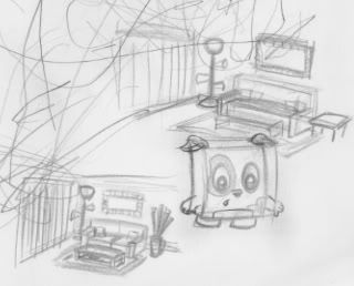
This is just a little doodle I did during the thanksgiving holiday (as well as the Adelia drawings from the previous post. I'm just trying to think of different areas like a living room - where it's just normal and sterile and boring...and I want to put my characters into that to liven it up. The reason why is that I was at an illustrator event at the beginning of November and did a portfolio review with an award winning illustrator (and one that is constantly working).
He told me that you can't just have drawings of fantastic action...in your portfolio you should also show that you can take someone's script (children's book or otherwise) and create all the scenes from the book...and, in a way, make the mundane bits interesting. You're not always going to have the characters skydiving or having a pig pull a skunk in a wagon through a field... You also have to have them in the quieter times.
So my current idea for my next postcard (after the skydiving one) is to have the square characters sitting around their living room and reading.
Also - the scribbles on the page are from my 3 year old niece who saw me drawing and wanted to draw me a picture.
Tuesday, December 01, 2009
Adelia thumbnails...
I work at Nickelodeon - and while we do all (or most) of the regular cartoons in our building, the nick jr stuff is mostly taken care of elsewhere. And the headquarters for Nick Jr (programming like Blues Clues, Dora the Explorer and Olivia) is in New York, so we almost never see the people who work on them.
Why that matters is that all the big executives for Nick Jr are in New York, and if you want to pitch something to them, you have to go to them. What's quite nice is that the Vice President and the production manager came to our little studio in Burbank a couple of weeks ago and sat in a meeting room for an entire day taking our pitches....
It was great meeting them, and I showed them this character that I've been working on for the last couple of years named Adelia (you'll see her all over my blog and/or website - www.isaacmarzioli.com). They loved the character but probably won't use her because of how I designed her. I intentionally drew her without a mouth because she started off as an adelie penguin and that pointy nose was originally a simplified beak...somewhere in the design process, the character became more stylized. The beak became an upturned nose. My thought was always to have her as a character that has a narrator, and while she isn't a mute, she doesn't have to say anything to get her story told.
One thing you have to be able to do when you pitch a character or a show or whatever is be willing to adapt. While it's your job as a designer or illustrator (or, more broadly, a creator) to come up with the original concept - it's their job to hone it and refine it into something that can be watchable and hopefully successful. I'm trying to redesign Adelia with a mouth to get the VP's attention that maybe this character is still a viable option for them, but at the same time I'm hoping to show that I am willing to revise and that I can work with critique.
I expect nothing to come of this, of course, but it can't hurt to try. If things don't end up working out then I can always go back to my original design of Adelia.
I'm still trying a couple of different ways to incorporate a mouth with the character. Do I make the mouth a full part of her head shape? Or should it be more stylized and appear on the one side of her face (which I like more because it's smaller and cuter and stays out of the way of the rest of the head design). Anyhow - I'm still working at it...
Microstock report for November 2009
November was kind of a down month for all of the vector sites. And while I did finally have time to upload a couple of new images, there was nothing that really clicked with the stock buying public.
Shutterstock is still the highest money maker with almost $147. This site has been pretty consistent for the last few months - each time around the 140 dollar range.
Istockphoto was a little bit of a disappointment after a $70 and a $106 couple of months. This time around it dipped significantly to $60.
I'm hoping to add more christmas images, but once again, I don't know if I'll have time. Also - with it being this close to christmas, I might have missed my window of opportunity....maybe I should focus more on valentines day.
Labels:
istockphoto,
microstock,
shutterstock
Subscribe to:
Posts (Atom)