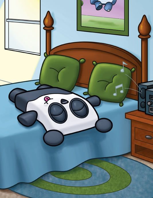
I was incredibly impatient with this piece - which made me post an incomplete illustration of it earlier this weekend...but I finally finished it.
The difference might seem minor - but I think they really help the piece out. First of all - it was originally too big....there was just too much empty space...and even after I finished the light coming in the window, it still looked too open and empty...So I cropped a bit out - added a poster that was in the original drawing (I actually had two posters, and when I was in the cleanup phase of this illustration, I turned one of the posters into a window and got rid of the other poster altogether).
It's definitely a much stronger drawing.
Saturday, August 08, 2009
Subscribe to:
Post Comments (Atom)

3 comments:
OH! the little panda is sleeping!
Adorable!
Cata
nicely done!
Lovely illustration.
Post a Comment