Tuesday, August 18, 2009

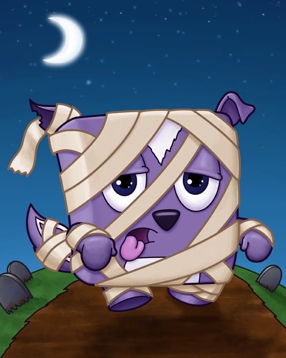
IF: Wrapped, mummy finished!

Well, even though it is obvious to go for a mummy illustration when the subject is wrapped (that or some form of present), it's still always a good way to go. Because any time you can draw one of your characters as a monster is always a good idea.

skunk,mummy

And, apparently, I like drawing my characters as monsters as I've already done a penguin frankenstein, a penguin igor, a little kid Freddy Krueger, a little kid Jason (from Friday the 13th), and, even though he's not a monster, a little kid Ash from Evil Dead 2 (he kills zombies). Oh, and I drew Adelia as a zombie. I just have to make sure to keep little kid Ash away from Zombie Adelia...or it could get messy...

Friday, August 14, 2009

IF: Wrapped - mummy style...

I think a bunch of people will have this same concept for the Illustration Friday topic of wrapped...it's either going to be mummies or presents.  I saw one guy do a whole crowd of people wrapped up in condoms (like in the Naked Gun movie, where they're practicing safe sex)...so that was one fella thinking outside the box...as for me, I'll jump at the chance to draw a zombie or a monster (especially a classic monster)...but, of course, I have to do it my way...so here's a cute little skunk mummy about to terrorize!


Photobucket
skunk mummies stink

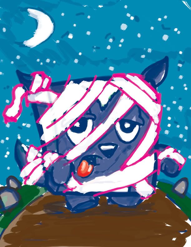
This was about a 20 minute rough - from start to finish - it's a really rough photoshop drawing, and would have gone quicker (most of my roughs are a lot quicker) but I wanted to add color and post it up.  Usually I'll just do a basic drawing and copy it over to illustrator to work on my lines and correct my perspective and finalize my drawing...and, of course, I'm going to do that with this one as well, but I thought I'd post up my color rough...
Saturday, August 08, 2009

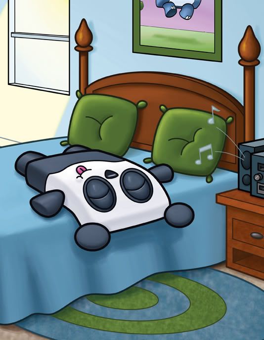
IF: Impatience - Panda relaxed...

I was incredibly impatient with this piece - which made me post an incomplete illustration of it earlier this weekend...but I finally finished it.

The difference might seem minor - but I think they really help the piece out. First of all - it was originally too big....there was just too much empty space...and even after I finished the light coming in the window, it still looked too open and empty...So I cropped a bit out - added a poster that was in the original drawing (I actually had two posters, and when I was in the cleanup phase of this illustration, I turned one of the posters into a window and got rid of the other poster altogether).

It's definitely a much stronger drawing.

Photobucket

Friday, August 07, 2009

IF: Impatient - onna bed

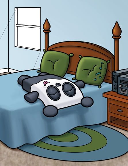
I've been working on this piece for about two weeks now - and I'm very impatient about getting it done and getting it online. I already posted my thumbnail and cleanup version of it - what I have here is my first color pass...

Photobucket

I thought about this piece during the Illustration Friday week of Idle. It seemed like the perfect weekend afternoon...lying on one's bed bopping out to your favorite tunes. The bit I haven't finished is the sun coming in the window - I'm struggling to figure out if I want to see the sun, or if there should be a cloud or a tree or a cloud AND a tree or what. The thing I do know is that I do not want the sun shining directly on the character....now I know animals like lying in the sun as it comes through a window - but I hates it! I could see sitting on a heating vent in the winter, but lying in the sun, in my opinion, is miserable. That's why I decided my panda character wouldn't like it either.

This picture, I guess, is showing the opposite of impatience...so try and ignore that aspect if it... I'm almost finished coloring, and I couldn't wait to put it up...
 
Free Hit Counter