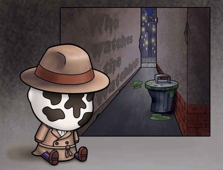
I finished my lil' Roarshach painting yesterday, but I wasn't happy with it. There was something missing from it, and other things that were just off. In my opinion (see, this is how it fits into the IF) I needed to make some changes. There were too many light sources (in the original painting) in the alleyway. There needed to be more of a defined shadow under the garbage can. And the words "Who watches the watchkids" needed to stand out more...I did the words in three different colors (previously) and didn't like any of them...well, I liked them okay, but they weren't working out as well. I toned down the texture on them (because that was one of the biggest problems in making them readable) and I think the piece works a little bit better. And it always bugged me that the buildings in the background didn't have any lights in them.
I also put it up on my blog at a bigger size (the original size of the piece is 9x12 and when I posted it last time I shrunk it down to 7 inches). So...I really like how it turned out - I feel that it's a stronger piece now.

5 comments:
I like the lights on the buildings in the back. I also think the gray color works well.
i agree Isaac, it's def stronger now. I like the gray text on the wall much more than the blue. Good choices.
Yes it's better now,love it
It's great Isaac.
It seems to flow nicely.
That is the cutest Roarshach! I want to give him a hug :)
Post a Comment