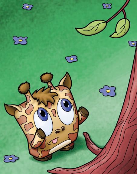
"Evolution wiped out the short and stumpy giraffe"
11x14 - Lines drawn in Adobe Illustrator
Color painted in Adobe Photoshop
I made these characters with extremely short arms and legs - the only reason being (besides looking weird with long limbs) is that shorter arms looked cuter. But because of that I seem to only think up pictures where one of them is at a disadvantage because of it. In this picture I wanted to get a different angle than what I usually draw (three quarters front view) - so I chose a down view to help accentuate the giraffe's shortness.
I also wanted to do this one because giraffes are very iconic in their markings - and I hoped that even though I compressed it into a cube, that it would still read as a giraffe.
Anyway - this is yet another piece for my show - I'm still looking at it as not finished, but it's almost there...
3 comments:
he is super cute, he needs to find a bush to eat.
hahahah funny :D
I feel for that giraffe. I love how the tongue sticks out. I guess that giraffe is concentrating really hard.
Post a Comment