Tuesday, June 30, 2009
Microstock earnings for June, 2009
This month was the second in a row where we had no time to upload new images. We had a total of 9 images uploaded to Shutterstock (three were just variations on another design) but none of them really did anything. Tracey did this image:
Which I was quite impressed with - it was done entirely in Adobe Illustrator - and it looks so photo realistic to me - and while we've had some bites on it (downloads), it hasn't taken off like I expected it to. Hopefully some chocolate strawberry eaters out there will start taking notice and download it (and download it a lot)...
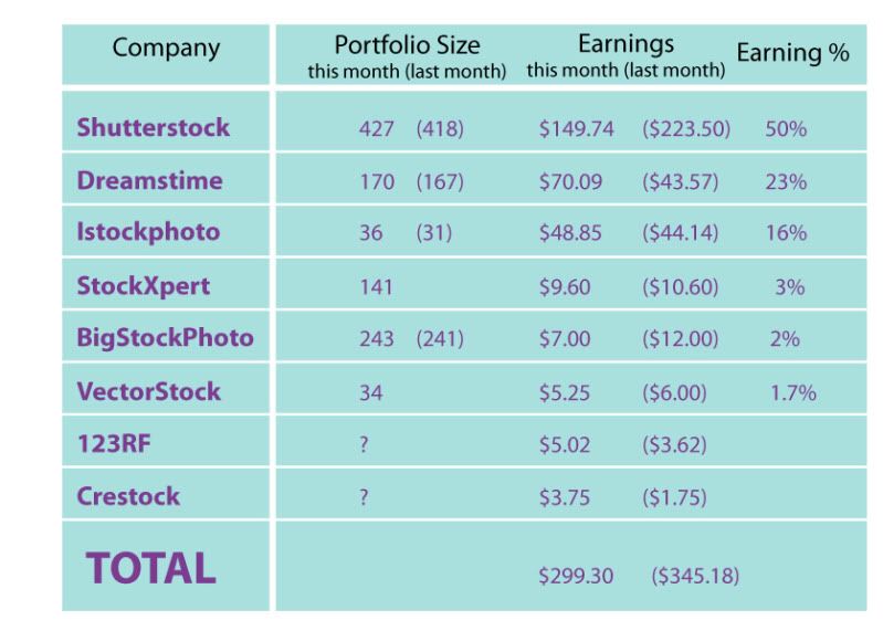
Shutterstock was still our highest earner with 149.74. It's still the best site as far as consistant downloads and it's the easiest to get accepted to (as well as having the most lenient of file acceptance rate of any of the microstock companies)
What surprised me was Dreamstime - they do a contest every month and the topic for June was cooking - so I whipped up a little drawing of a boy making pancakes (and Tracey colored it) - it didn't win the contest, but yesterday it was downloaded for 25 dollars! It's the single highest amount we've received for a file, and it pushed Dreamstime into second place with just over $70 for the month. http://www.dreamstime.com/res1220499-stock-images
the third place finisher was Istockphoto - like Dreamstime, they were the only two microstock agencies to end with a higher total than last month. Our uploads are very slow on these sites (only 3 for dreamstime and 5 for istockphoto), but it hasn't affected our download rates (which have also gone up on these two sites)...
The rest were kind of disappointing...Stockxpert had consistant downloads all month long - but it was only 1 or two per day - which ended up at a low 9 dollars...and the rest of the sites are barely worth talking about...
Whoops - I did forget (for the second month) to list Fotolia on this list. They made a comeback in terms of monies - just under $20 for June. But the downloads are so few and far between...it was rather disappointing to ever check the totals. The only good thing is that the choco strawberry was downloaded 3 times (for a total of $3.90)...hopefully next month it'll pick up - but i doubt it. What sucks is that this site was only accepting vector art as svg files (a terrible vector format) and this last month they finally caught up with all the other agencies and started accepting things as eps or ai files (the accepted Adobe Illustrator versions of vector art), but since I had already uploaded the majority of our stuff as svg files, I expect we're missing out on a lot of sales because they're all the old format.
Anyway - that's the month of June for microstock...once again it was nice to clear $300 (with the addition of fotolia) without having to put in any work. That's why I got into microstock in the first place...was that way my illustrations could sit around collecting me small amounts of money instead of dust...so far, so good!
Labels:
2009,
dreamstime,
istockphoto,
june,
microstock,
shutterstock
Sunday, June 28, 2009
IF: Worn Out - Trying and failing...
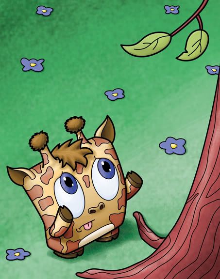
"Evolution wiped out the short and stumpy giraffe"
11x14 - Lines drawn in Adobe Illustrator
Color painted in Adobe Photoshop
I made these characters with extremely short arms and legs - the only reason being (besides looking weird with long limbs) is that shorter arms looked cuter. But because of that I seem to only think up pictures where one of them is at a disadvantage because of it. In this picture I wanted to get a different angle than what I usually draw (three quarters front view) - so I chose a down view to help accentuate the giraffe's shortness.
I also wanted to do this one because giraffes are very iconic in their markings - and I hoped that even though I compressed it into a cube, that it would still read as a giraffe.
Anyway - this is yet another piece for my show - I'm still looking at it as not finished, but it's almost there...
Labels:
IF,
Illustration Friday
Monday, June 22, 2009
IF: Worn Out - Ferocious Elephant Charge
The little guy is all worn out...
This is another piece for my show...it turned out a lot better than I expected - I originally wanted to do a series of one character drawings at 5x7 or something - but these were turning out so well that this is going to be a 11x14 monster! Well...that's a monster for me...
News!!! - I just found out this image is featured on Illustration Friday for last week! Thanks a lot! I really liked this illustration and I'm very flattered that they chose me. And thanks to all of you who have (and who might) leave a comment!
And, as I mentioned above, this is a digital illustration for my art show at Nickelodeon (in Burbank, CA), which starts next week. I'm going to sell prints of all of my pictures...and in case anyone wants to buy one the tired elephant pictured above - you can purchase it through paypal - each print is 11x14 and is $15:
Labels:
IF,
Illustration Friday
Sunday, June 21, 2009
IF - Drifting: Adelia's Heart
As I move forward in trying to build up a children's book illustrator portfolio (the long term goal) and the small gallery show at Nickelodeon Animation (short term...which is coming up way too soon), I'm drifting further and further away from the character that I originally created.
This little gal was supposed to be the next Olivia - and then I just couldn't come up with a decent enough story - I've done up a dummy and sent it out to several companies, but no luck...
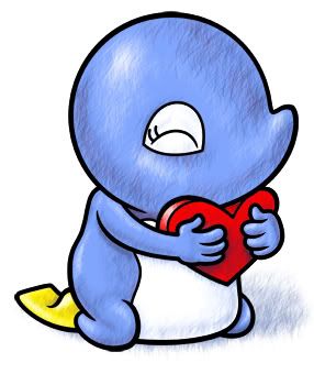
I did this drawing originally in watercolor, a couple of years back. Then, as I was developing my children's book I was experimenting with a style of shading/texture that worked for a time, but I've drifted past that as well. This is the original photoshop color (with hatchey texture):
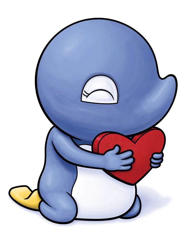
And this is the new version. As with the original, the lines were created in Adobe Illustrator and then pasted into photoshop and colored. The main difference (as they're almost exactly the same color and light source) is the coloring technique. I've moved on to more of a painterly brush stroke look. And that's where my current drawings are. It's been difficult to leave brush strokes in...as my instinct is to completely smooth out the color...but while it's a struggle, I think I'm making headway and it's looking pretty decent...
Also - the color is slighty less saturated - the reason why is that I did the first one in RGB color and the new version in CMYK (rgb for web, and cmyk for print) - as I'm printing these out for the show...and I think the feet (in the original) were way too bright yellow...
Labels:
Adobe Illustrator,
IF,
Illustration Friday,
Photoshop
Saturday, June 20, 2009
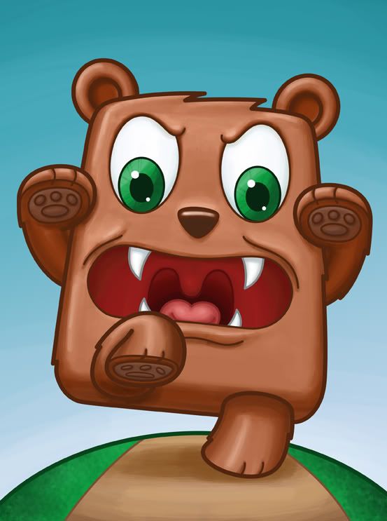
IF: drifting - Angry Bear Attack
I'm still working on images for my gallery show...I started with the Parade which had so many characters - but it seems that the more pieces I work on, the more I'm drifting towards doing illustrations with just one character...
I have two more of these in mind - I just watched 3:10 to Yuma, and I want to do a cowboy character...we'll see how it goes...
All the lines were created in Adobe Illustrator, and the color was done in Adobe Photoshop.
Labels:
IF,
Illustration Friday
Sunday, June 14, 2009
IF: Modify - Escalating the juggling - the story unfolds...
These are a couple of pieces I did for my art gallery show at Nickelodeon Animation (which, sadly, is ending it's run next week). I modified a few key elements in the first illustration to make it more interesting.
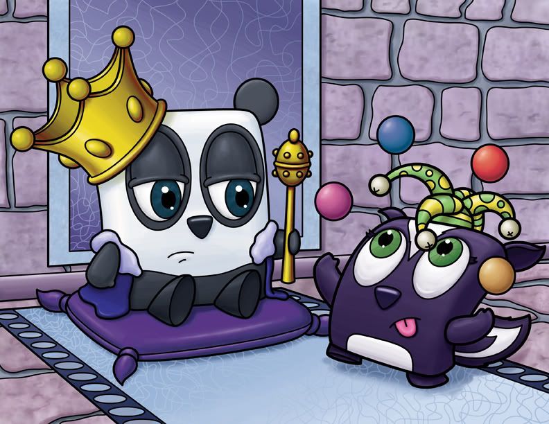
So I've done this piece - which I'm posted already - but in an attempt to push the boredom on the panda's face, I changed his eyes to have him look away...
In doing this piece - I had conceived it in two parts (originally it was three, but I don't have the time to do another one as the gallery show is in two weeks!)...the above illustration was part one...the jester isn't really hacking it...
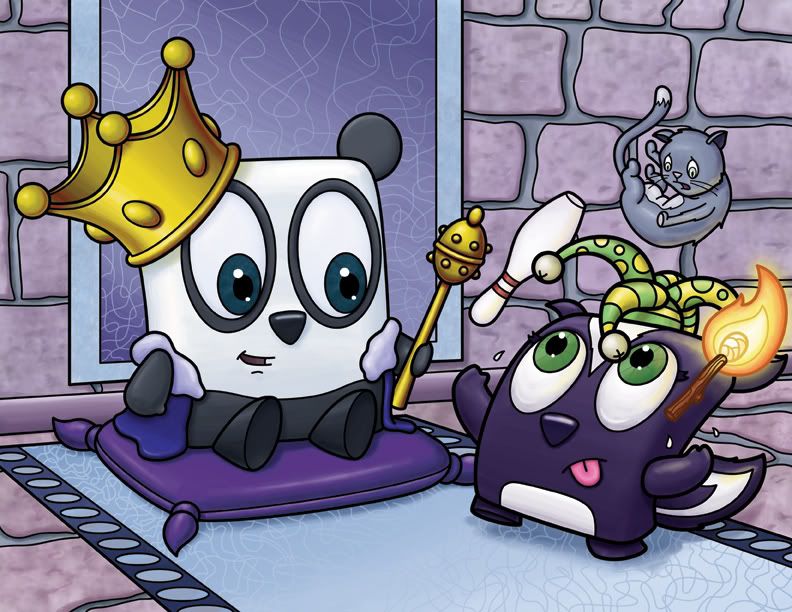
My second piece was originally going to include chainsaws, but seeing as how this was going in a gallery where children would see it (at Nickelodeon), I decided to do a tiny bit of self editing...I know the gallery doesn't let you put up paintings with guns in them...and while I don't really know their rule on chainsaws, I figured it was smarter to take it out and go with a bowling pin. Plus, it was pointed out to me, that the chainsaw might take away from the thrill of seeing the jester juggling a cat.
So I've done this piece - which I'm posted already - but in an attempt to push the boredom on the panda's face, I changed his eyes to have him look away...
"how to lose your cush juggling job"
I really thought that worked.In doing this piece - I had conceived it in two parts (originally it was three, but I don't have the time to do another one as the gallery show is in two weeks!)...the above illustration was part one...the jester isn't really hacking it...
My second piece was originally going to include chainsaws, but seeing as how this was going in a gallery where children would see it (at Nickelodeon), I decided to do a tiny bit of self editing...I know the gallery doesn't let you put up paintings with guns in them...and while I don't really know their rule on chainsaws, I figured it was smarter to take it out and go with a bowling pin. Plus, it was pointed out to me, that the chainsaw might take away from the thrill of seeing the jester juggling a cat.
"how to keep your cush juggling job"
Now that's some fine juggling!
Labels:
IF,
Illustration Friday
Wednesday, June 10, 2009
IF: Craving - excitement...
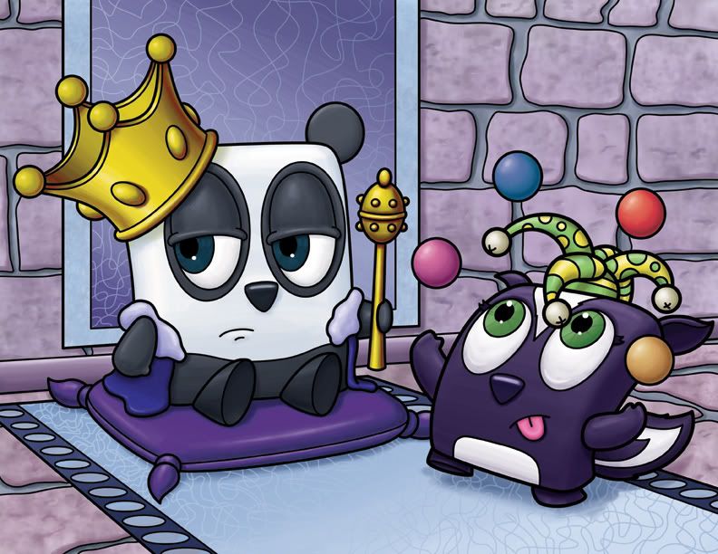
I've conceived this piece in two parts - this is the first picture where the 'king' is bored with his jester. (and in the second picture, which I have yet to draw) The king, craving excitement, has his jester up the ante by juggling something more fantastical (I'm thinking chainsaws...but we'll see)...
So anyway - this is the first picture, and I'm going to work on the second picture, hopefully finishing it by this weekend...
EDIT:
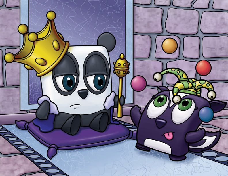
I had a couple of (people I respect give) some constructive feedback about this piece - so I redid several bits - I changed the ball colors that the skunk is juggling (as well as moving the top ball down a little bit, so it was overlapping some of the rock background and not framed by one of the rocks), I also changed a bit about the carpet - moved it away from the wall, made the circles on the right hand side smaller, and made the pattern blend in more...I like the changes, and I think it's a stronger piece!
Labels:
IF,
Illustration Friday,
panda,
skunk
Monday, June 08, 2009
IF: Craving - pancakes!
I did this piece for Dreamstime. They do a contest every month based on a concept - this month it's cooking. So that contest fit well into hand with Illustration Friday and their concept of craving - because who doesn't crave pancakes (more on this at the end of this post)....
When I have the chance, I'm going to redo this piece for other stock agencies - because of the nature of the contest at Dreamstime, everything you submit has to be exclusive with them - so I'll have to change it to something like the kid flipping burgers outside or something. But the character, the perspective, and the colors are already in place, so it should be easy enough to change around for other stock illustration sites.
Who doesn't crave pancakes? I used to say me. The problem was that we had them every day for years. Were they cheaper to make? Was it because they were easier to make than a normal breakfast (normal for my family was eggs and rice - mashed up, of course - and a side of bacon or sausage)? All I remember is that we'd have this doughy brown circle on our plate every morning...and no amount of syrup was going to get that entire eaten...a nice side effect is that because my stomach was eating itself (as there was nothing else in there), the lack of carbs in my diet kept me thin.
Sadly - the years of pancakes gave way to the years of oatmeal...but that's a whole other blog. The good news is that IHOP played a significant role in bringing pancakes back into my life...having a variety of pancake types to choose from definitely helped, as did those long years where I swore off pancakes completely...
These days - if you're craving a particularly terrific pancake, and you're in Los Angeles - you should check out Cafe du Village - it's a french cafe in the Larchmont area and they have the best brie cheese sandwich - but also some pretty great blueberry pancakes. I can't get enough of them...
Labels:
cafe du village,
dreamstime,
IF,
Illustration Friday
Saturday, June 06, 2009
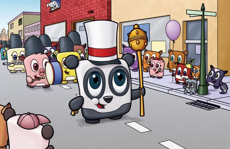
Finished Parade
I worked on this piece nonstop for two weeks...I thought it would go pretty quickly, but there was just so much to do. I created this (as well as many other pieces) for a gallery show I did at Nickelodeon Animation back in July.
It's good and bad that the show has come and gone...bad because I was working at every possible minute to finish just one more piece (I ended up having 4 extra illustrations in my show because of this) and I was getting burned out...but it was good because a lot of art was able to come out of it...and it was all stuff I probably wouldn't have thought about if I didn't have to impress all these animation folk.
Labels:
IF,
Illustration Friday,
panda,
parade
Tuesday, June 02, 2009
IF: Adapt - making the parade
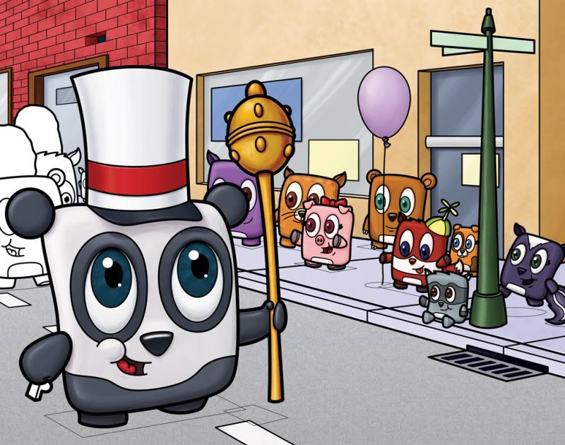
This is my 'big' piece for the Nickelodeon art show I'm doing at the studio in July...I'm hoping to have several more whipped out before my deadline (end of June)...but we'll see...I have to finish this one first (which should be by Thursday or so)...This is still a work in progress, so maybe I shouldn't have posted this drawing...but I really like how it's coming together.
As you can see (if you look closer) I have indicator lines where the shadow will eventually go...so those lines (which I did in adobe illustrator back when this was just a simple line drawing) will eventually be deleted and shadow will take their place...
It's been quite a struggle...as I've gone way beyond my comfort level and did a piece with so much detail and way too many characters...and I have to adapt my style to encompass all of this, which is difficult, but, if nothing else, this art show was a good way to challenge myself. but I have less than a month now, and lots of illustrations floating up in my head that want to come out...
Labels:
IF,
Illustration Friday
Subscribe to:
Posts (Atom)