Here is my latest piece from Adelia.
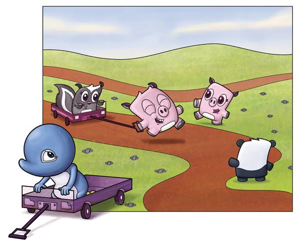
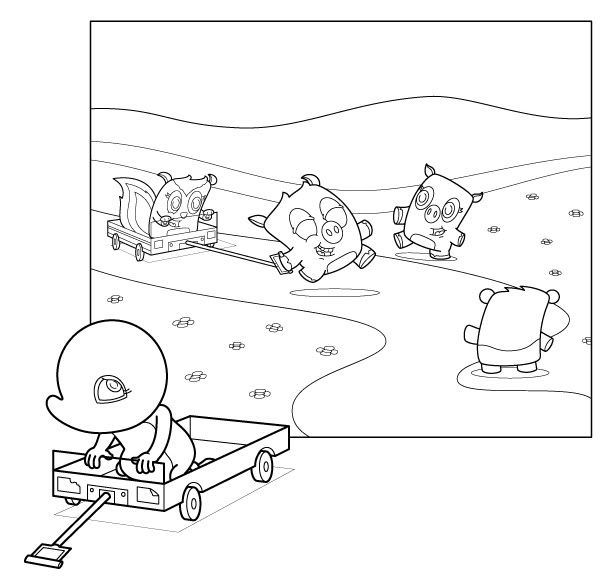
Originally Adelia (the little blue penguin character in the foreground) was mostly outside the framing. I just joined a critique group through the SCBWI and it was suggested that I push her back into the frame a bit more. It made for a piece that worked better together...Adelia became a part of the picture once she was contained (mostly) within the frame. From there I went and colored it:

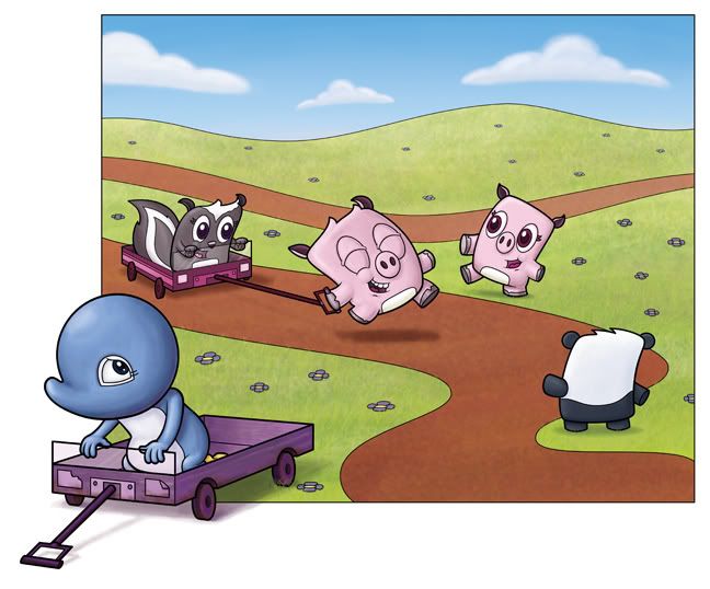
I then submitted it to the Illustration critique group and got some more feedback. From this I did a set of revisions - adding flowers to the back hill, desaturating the road (which was getting a little too much attention), adding shadows to the wheels on Adelia's cart (which I just completely forgot about), adding shadow to the flowers themselves (to give them more dimension), shrinking the size of the hill line (as the black line was a little too thick), desaturating the skunk's cart, and finally, saturating the sky and changing the clouds to less sucky ones. I'd say the old version PALES in comparison to the new and improved version.
I've enjoyed doing all these characters together, and when I have time, I'd like to eventually put a story together around them. As for now, they're just going to help me out as a terribly cute subject matter.
I've enjoyed doing all these characters together, and when I have time, I'd like to eventually put a story together around them. As for now, they're just going to help me out as a terribly cute subject matter.


5 comments:
Looks great, Isaac!
I think you have resolved this wonderfully! Great job ...on to the next piece!
They all are so cute!
- Gracie
interesting to see the progression, adorable characters too :)
its meeeeeeeeee....Candy btw....I put your biz card on the front of my stove! beautifully displayed :)
Post a Comment